Here at Knowband, we get questions from all our clients looking to boost their checkout conversion rate, if they should switch to a one-page checkout?
Their aim with the question is simple; they want to get more check-out page conversions, fewer cart abandonment, and more sales. We respond by always saying this, “It depends”. It sometimes comes as a surprise to most customers to hear this reply. As we are selling a one-page checkout Extension, and still not pitching a sale to them. Maybe they expect an answer like “Yes, it is the best. You should use our one-page checkout”.
I wish it was this easy. We don’t pitch our solution with a blindfold, instead, we recommend them something that will help them understand if their issue can be solved by simply installing the one-page checkout module. Let’s just take a pause and inspect some pros and cons of one-step checkout and then decide, whether a one-page checkout is simply an all-in-one solution for all your issues?
The misunderstood part of the one-page checkout solution
This is a common misconception among the eCommerce store owners that the one-page checkout is one medicine to all the check-out-related cart abandonment issues. It’s really understandable. The Fewer steps a customer has to go through easier it will be for him to complete the process and checkout bounce backs will reduce.
However, that’s not always the exact case. The implementation of one-page checkout is definitely appealing, but it does not mean it is the solution to all your issues. Truth to be told, one-page checkouts have their own set of problems that should be addressed to make them more organized and informed for the customers. Simply, a one-page checkout solution can make your store, but can also break it with some negative impacts if you don’t know the correct way to implement it.
For the customers who inquire about our one-page checkout, often time we come to hear that they read some article or attended some event where they told it is better. Most likely these customers did not pry into their existing multi-step checkout process and neglect the mistakes they are already doing with their checkout. So, even if they go for a one-page checkout, they are more likely to repeat those same mistakes, and then blame the checkout solution for the breakdown.
Consider these factors before deciding your checkout page:
So, Which one should you consider, One-Page Checkout or Multi-Page Checkout? An honest reply would be both. A one-page checkout can be really effective in the right conditions and with proper implementation. You need to make sure that it addresses the common issues of a one-page checkout and has handled them effectively.
The right conditions for deciding the right checkout process for your business can depend on the aspects like:
- Niche
- Customers
- Price point
- Product Type
- Pain Points and
- Solutions
For instance, if you are selling luxury items that already receive fewer sales due to the high price point, and you have a loyal base of old customers, then a multi-page checkout is a better choice here. It will guide the users through the checkout process and will convert better.
On the other hand, if you sell non-expensive items where there are more sales and you are also offering free shipping options, then a one-page checkout solution would be more effective here. It will be quick, give a faster way to review the products in the cart, show the free shipping option right away, and allow the shopper to make the payment straight on the same page.
Perform A/B testing for the best checkout page solution
These are just the example of two simple cases. However, the best way to know which option works best for you is to test, analyze, test, and iterate. A/B testing can be really helpful where you can test both the types of checkout (i.e. one-page checkout and multi-step checkout) at the same time and see which one pleases your customers better.
Be cautious while testing, because here you’ll be pitting the best against the best. You wouldn’t get the right results if you compared a well-optimized one-page checkout to a cluttered and unorganized multi-step checkout. So, always test an apple with another apple.
A simple recommendation would be to first optimize the current multi-page checkout as far as possible. Once, you have fully optimized the multi-step checkout, then compare it with a well-optimized checkout by testing them. It will give a fair chance to your multi-page checkout, or else, the one-page checkout solution will always overshadow it.
One-page checkouts still have some benefits by default
- The one-page checkout is quick since everything is on a single page.
- There are only a few steps for customers to complete on a one-page checkout solution.
- Well-optimized checkouts provide the cart review option on the same page.
- Shipping option selection is available on the same page in the one-page checkout module.
- The one-page checkout offers payment options on the same page.
- Some advanced checkouts offer social login options as well.
Features to look for while selecting a One-Page Checkout Solution
Optimization is one such thing that differentiates a checkout Page from another checkout solution. Whether you are talking about a multi-step checkout or a one-page checkout, it has to be well optimized. You won’t be able to solve all of the problems with the checkout page by simply consolidating it onto a single page; you’ll still need to optimize it for cart abandonment issues.
A true one-page checkout developed to curb the checkout page abandonments must address the issues like these:
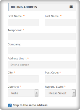
Length- The length of the checkout process does not merely depend on the number of pages, but the number of details a customer has to fill in to complete it. Make sure your one-page checkout does not ask the customers to fill in unnecessary and redundant details. You can segregate the mandatory and optional fields.
For example, you can reduce the billing or shipping address form size by removing the unnecessary fields like fax number, anyone from the phone or mobile number, etc.
Cart review and update- What most of the one-page checkout solutions miss is the option for the customers to review their cart and update the product quantity from the checkout page. However, there are Advanced one-page checkout solutions that do provide the cart review and update options. So make sure, your one-step checkout does provide this feature.
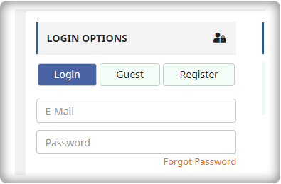
Guest checkout: Guest checkout is an important feature. On both the checkouts(i.e. one step checkout or multi-page checkout), if you miss providing a guest checkout option, then you may lose some business. So, make sure whichever checkout option you choose, you should offer the guest checkout.
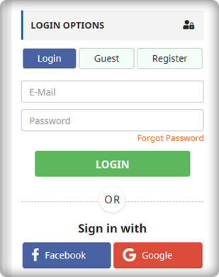
Social Login: Social login option is more of a competitive advantage than an optimization. If you are not asking your customers to necessarily create an account and offering guest checkout, it’s optimization. However, if you are allowing them to sign up or log in with their Facebook or Google Account, it’s a competitive advantage. Our PrestaShop one-page checkout offers social login through Facebook and Google to help you gain the most out of your checkout process.
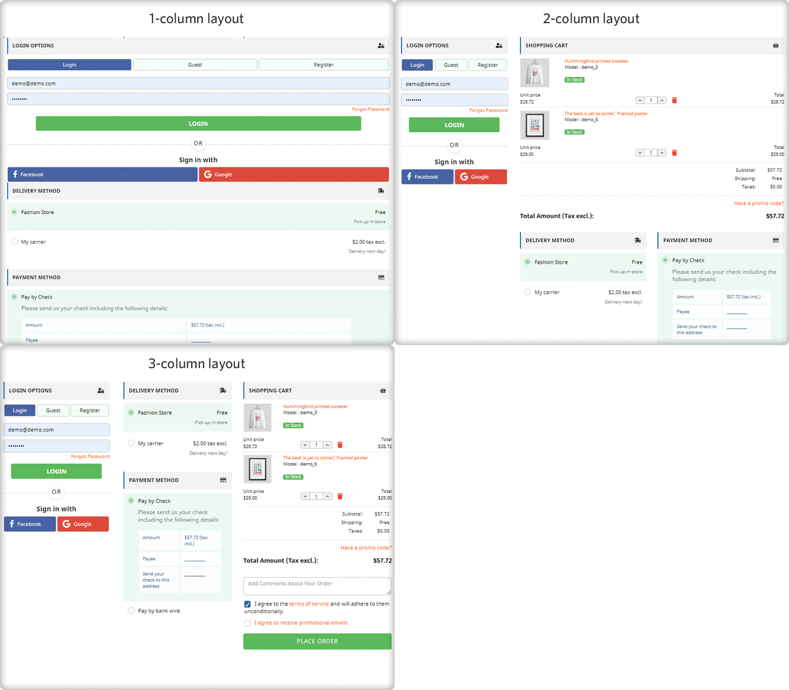
Clutter-free design: What haunts most of the merchants while switching to one-page checkout is the design issue. A one-page checkout in-housing the whole checkout process on a single page is more likely to look congested and cluttered. Therefore, you must ensure that your checkout page does not only fits with your theme design but should also have enough white-spaces to segregate each element and section. For example, it would not be a nice look if the shipping section overlaps the payment section or any other section of the page.
We have tried our best
We have tried our best to optimize our one-page checkout modules for Magento, OpenCart, and PrestaShop in the best possible way. We have included all the options that have been mentioned in the previous point. Moreover, we have also tried it to have the best possible clutter-free design.
Check out how we eliminated all the one-page checkout-specific issues in our checkout modules.
We don’t say a one-page checkout is a one-stop solution to all your checkout page issues. However, a well-optimized one-step checkout can always provide an upper hand. Optimize your multi-step checkout to the best possible extent and then test it with the one-page checkout solution, the results will ensure you have the best checkout, no matter it’s one page or multi-page. Always choose the best for your brand.
Liked This? You’ll Like These Too

