It’s a fact that users don’t sign-up easily nowadays. It is one of their pet peeves.
As per ReadyCloud’s report shared by Annex Cloud, it was found that 35% of the transactions were dropped because the site wanted users to create an account before checkout.
The stats collected by Baymard Institute also reported that nearly 28% of the abandoned carts in the US take place because users are presented with a mandatory sign-up process, making it the second major reason for cart abandonment after high shipping costs.
According to eMarketer, 88% of the consumers intentionally leave a website or provide false information. It could be due to frustration or privacy concerns but it has made one thing very clear online shoppers have set higher standards for the website registration process.
That’s why it is important to ensure that your site visitors experience less annoyance when registering for something on your website. If you rub them the wrong way, you might lose a lead or a potential customer.
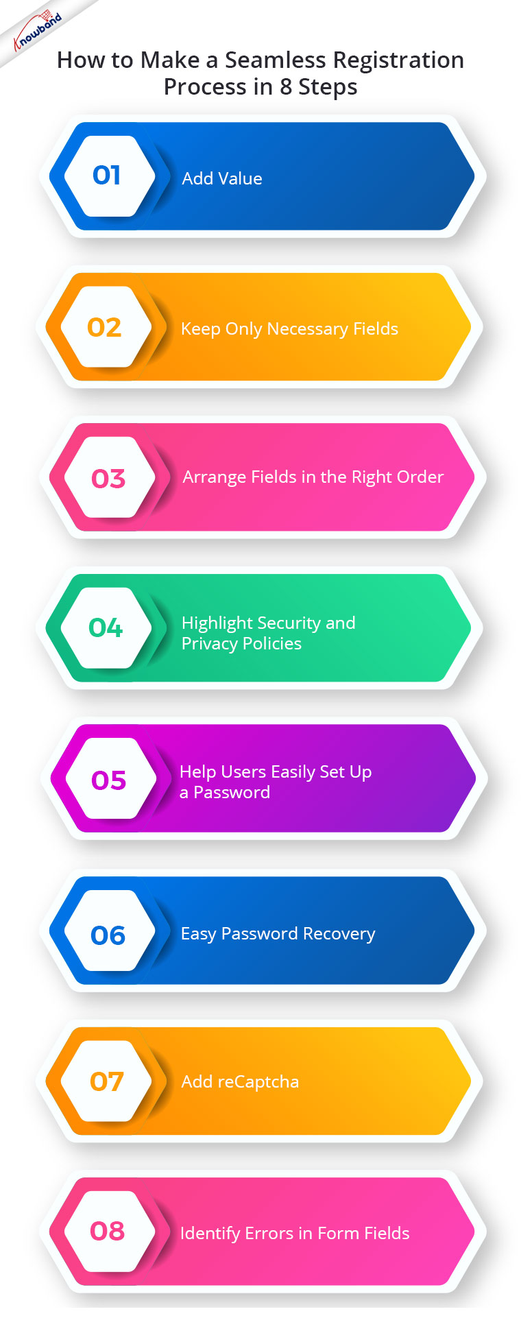
8 Ways to Create a Seamless Registration Process
It is also obvious that online businesses do require users to register (for different purposes) but it should be done fruitfully. Let’s understand how to do that.
1. Add Value
People usually won’t register if they aren’t getting any value. Explain why a visitor should register on your website or for whatever purpose you want to capture their details. Write a short and creative copy that highlights the major benefits so that they get a reason to signup.
2. Keep Only Necessary Fields
The fewer the form fields, the better it is. Consider what information you majorly require. Keep only those fields and eliminate the unnecessary ones if you want to avoid mid-form abandonment.
If you still require some additional information, make sure to mark those fields as optional; leaving the choice totally up to the visitors whether they want to provide that information or not.
Asking for too much information not only looks annoying but is also not helpful for lead nurturing.
Recommended Read: How to Hide Input Fields for Disabled Languages in OpenCart while Adding New Category?
3. Arrange Fields in the Right Order
Some eCommerce sites require users to provide a lot of information to register, such as shipping address, billing address, contact information, credit card/debit card information, etc.
While these details are necessary to ensure a safe and secure delivery, it should be kept in mind that they are presented in the right order in front of the visitors. If the process doesn’t follow a logical order, they will likely skip the registration task.
What’s the accurate order? The common practice that eCommerce websites follow to collect user information begins with the name, email address, and contact information, followed by shipping address, billing address, and card details.
An illogical order on the checkout page can severely affect your conversions. Try Knowband’s One Page Checkout module that allows you to set the priority of your checkout fields and make various other customizations.
Available for: PrestaShop, OpenCart, and Magento 2
Recommended Read: Build Responsive Single Page Checkout for OpenCart in a Few Clicks
4. Easy Password Recovery
If a customer lands on your website after a month or even a week, they have likely forgotten their password. They will try a few login attempts but will give up later. A study suggests that 45% of the users leave a website after they aren’t able to recall the password and witness login failures.
That’s when they head to the “Forgot Password” option. Make it as easy as you can to help them recover their password without putting much effort.
5. Add reCaptcha
If you do not want to get fake registrations, it is always a good idea to add reCaptcha to your registration page. It helps you identify between bots and real users and provides you with relevant information. You can get the Google reCaptcha module from our Knowband store.
Available for: PrestaShop and OpenCart
6. Highlight Security and Privacy Policies
Online shoppers remain highly concerned about a website’s authenticity. They hesitate to share their information. Reassure your visitors that their information is completely safe with you.
Include a privacy policy link on your registration page and also add trust badges related to payment and site security to eliminate visitors’ concerns.
7. Help Users Easily Set Up a Password
Many times it happens that users spend too much time creating a password, and it’s simply because it doesn’t match the criteria that the site requires. It usually takes 2-3 attempts to register successfully.
Let the password requirements not be a barrier in the sign-up process. While users create their password, make it very clear what kind of password combination your site accepts and what should be the minimum password length. Don’t keep the combination too complicated and keep the minimum password length to 6 characters.
Notify users about the password strength so that they can adjust accordingly, and while they confirm their password, display whether the password has matched or not. You can either display it in the form of a text or use right/wrong symbols. The latter would look better.
8. Identify Errors in Form Fields
Shoppers do make mistakes while filling out forms. It’s your responsibility to help them put the right information on the very first attempt.
If a user makes an error, inform them as soon as they switch fields. And don’t just tell them what mistake they made and where it occurred; explain how it can be corrected. If the entered input is correct, highlight it with a green tick.
Recommended Read: How to add a setting for a custom plugin in the WordPress setting menu?
Customize your Registration Form with the Custom Registration Fields module
The module lets you customize your registration/sign-up form as per your requirements. Apart from adding new fields, there are various options inside the configurations to help you set up the desired registration page.
Available for: PrestaShop, Magento 2
By including custom fields on the website’s registration form, online business owners may now learn more about their consumers. If the store owners learn more details about their customers, they can utilise that information to plan their product’s marketing and sales pitch. The Custom Registration Fields extension enables the store administrator to update the existing custom registration fields as well as add new ones. Setting validation rules from the admin interface to validate the fields is simple. The Prestashop extension enables admins to add any sort of field and customise its validation guidelines.
I hope the above-mentioned provided you with good insights on setting up a user-friendly registration page. For any assistance regarding the modules, you can contact us at support@knowband.com


