One Page Checkout is a smart way to put all the fields into a single page and present it to the customer in a sleek and clear format. It is like a box designed to keep your accessories separately but together. A Denmark-based company, CEP Sport added the One Page Checkout Module to their website and they have configured it in a well-designed manner.
The layout customization is quite simple and the addition of the progress bar keeps the user engaged. This article describes how beautifully you can create the Checkout page with One Page Checkout Module and implement the same on your eCommerce website like CEP Sport just did on their website.
What is CEP Sport?
CEPsport.net is a distributor of the German brand CEP and is operated by SportSupport ApS. CEP has the best sportswear on the market in terms of design, feature, and compression. They are even athletes who enjoy being able to move. It is well-supported by the most cutting-edge sports products in the market.
Implementation of One Page Checkout module in CEP Sport Website
From product page to checkout page, every eCommerce website design requires the best UI and UX. It is important to optimize the landing page but more needful to have a checkout page that does not add up to cart abandonment. CEP Sport has chosen KnowBand’s One Page Checkout module for their checkout page and we are glad that they trusted our module for the best Checkout Page Solution.
One Page Checkout has several features that make it best among the other available choices.
-> Visit CEP Sports Store and have a look at their Checkout Page Design by yourself: Click Here
It has a 3-Column Layout with a custom layout design
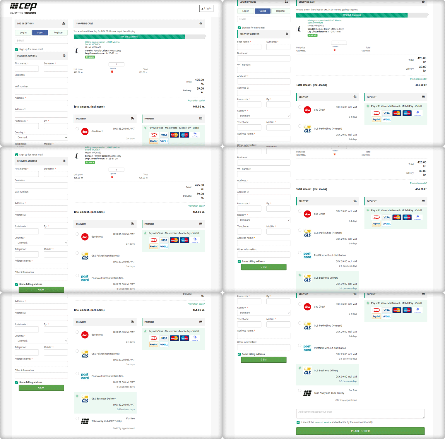
The Checkout page of CEP Sport has a 3-column layout design and the module provides customization features for the layout.
How layout can be customized? It allows you to choose a layout design (1-column, 2-column, 3-column). And, you can shuffle the fields and reposition them with drag and drop functionality.
In the picture below, you can see that the checkout page is customized and CEP Sport has designed it according to their requirement.
Shopping Cart CTA
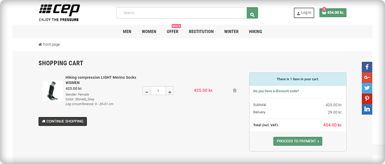
To reach the checkout page, it is important to have clear CTA (Call-to-action) buttons. The website is incorporated with proper CTAs.
Customers can proceed to the checkout page by clicking on the button ‘Proceed to Payment’ and it will redirect them to One Page Checkout.
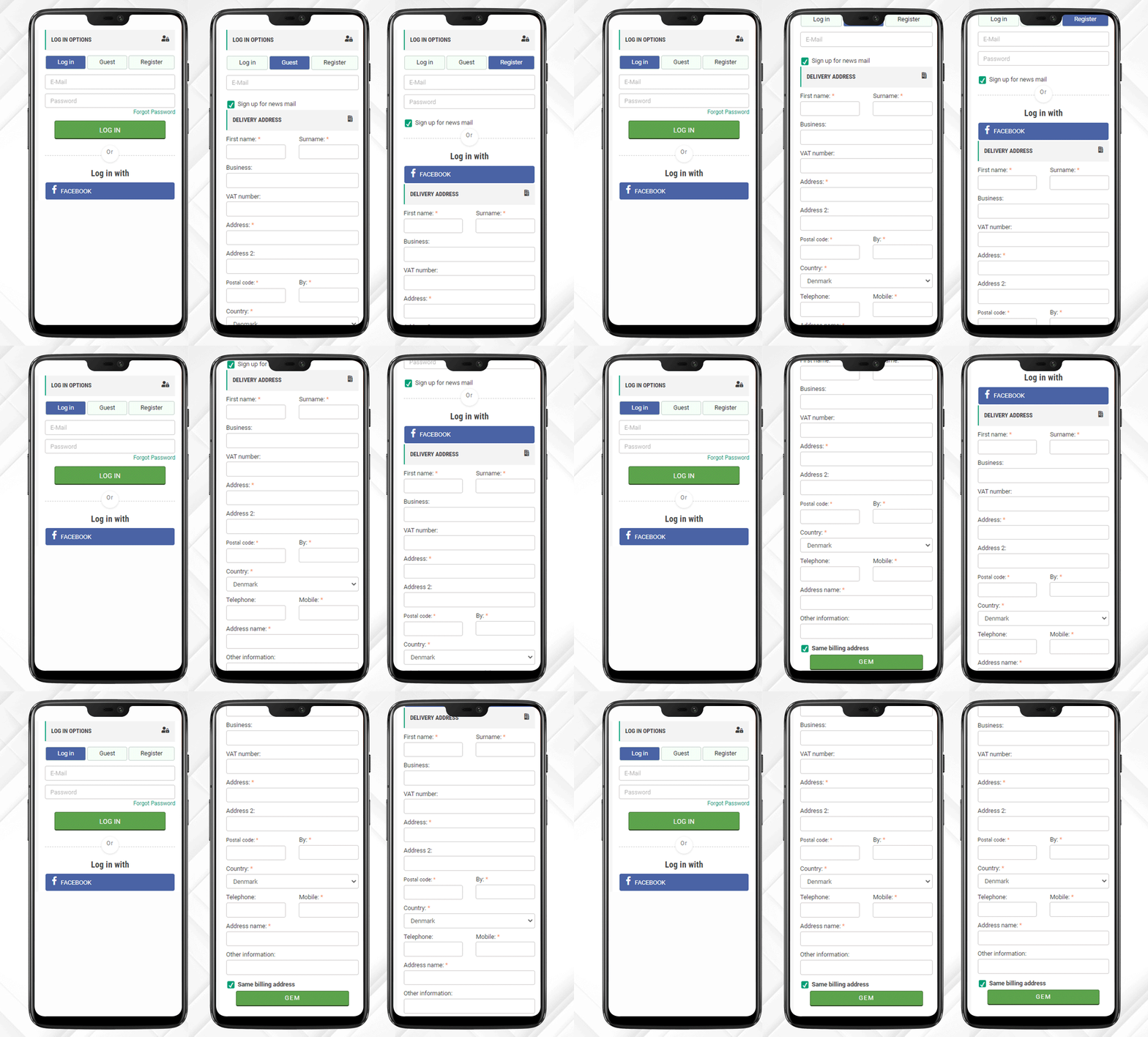
Login, Guest Checkout, New Registration
Once, the customer reached the checkout page he/she has to register himself and if he is in rush then Guest Checkout is also available.
One Page Checkout has three options:
- Log-in via email
- Guest Checkout
- Register as a New User
Log-in and Register with Social Media Account
Registration with a Social Media account like Facebook is quite handy and one does not have to remember the password for every eCommerce site. If a customer is registering via Facebook then he only has to provide the delivery address.
And, Checkout Process is sorted!
After registration, login can be done by entering the E-Mail Address and Password or a user can log-in by Facebook account.
Just one click and you are done!
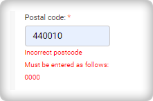
I am Mandatory* and You just filled in the wrong details
The mandatory fields can be highlighted with the Asterisk mark (*). Also, it immediately indicated the errors made by a user during the form filling process, called inline validation.
Delivery and Payment Methods
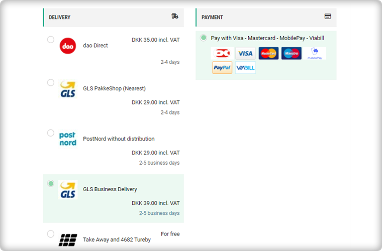
The Single Page Checkout of the CEP Sport website has several shipping choices and Payment Gateways. Along with every shipping method, extra charges (if applicable) are displayed. It is also possible to specify a particular payment gateway with a specific shipping method.
Progress Bar shows the user’s success
This helps the customer to measure the registration progress. If you think this is not necessary then you should know that a human brain works better if it knows how much work is left.
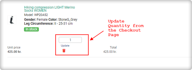
Update product quantity on Checkout Page
Another feature that makes it the client’s choice is the quantity update option. One Page Checkout allows customers to update the product quantity on the checkout page itself.
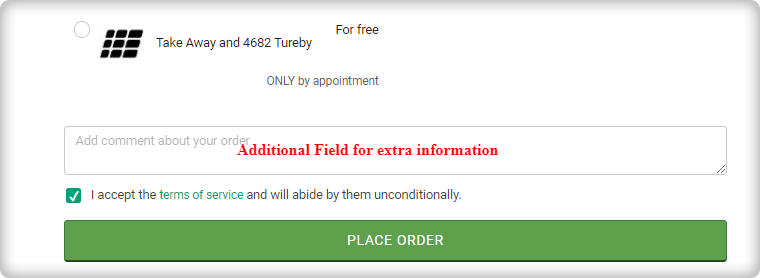
Add an extra field to collect more information
If a customer wants to add any comment about the order then he has an additional field for the same. Admin can add custom fields in the checkout page to collect information from the customer that can be used during email marketing for personalized email.
Since all the information is added correctly by the customer or the guest visitor.
Now, he/she can place the order!
Why do you need One Page Checkout in your online store?
We have had a successful tour of the CEP Sport website’s One Page Checkout. Now, it is time to understand the value of a single page checkout over the default multiple Page checkout available on eCommerce platforms. The One Page Checkout appears to be simpler because it displays all the fields on a single page before the form filling process. Guest checkout and social media login options are proven methods that increase registrations on the online store. It has a statistics analysis tab that shows the conversion rate and bounce rate of the checkout page. Several features make the One Page Checkout Module the client’s first choice for the checkout page.
The detailed article on Multiple-Page Checkout vs. One Page Checkout can explain this in a better way.
Admin Demo of One Page Checkout
Front End Demo of One Page Supercheckout
Support
KnowBand team is always available to help you with eCommerce solutions. We have 100+ modules available for eCommerce platforms like OpenCart, PrestaShop, Magento, WooCommerce, and Shopify. Visit KnowBand Store to explore more.
Get in touch at support@knowband.com and discuss your website requirements with our experts.

