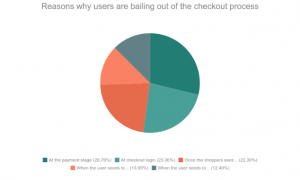
As per a data shared by Business Insider, the U.S. online shoppers, in particular, are abandoning their carts during the payment phase. This is a common scenario on both desktop and mobile platforms. Here are some of the phases according to the survey from where the users tend to leave the cart without completing the payment procedure.
- 46.1% of cart abandonment occur at the payment stage
- 37.4% occur at checkout login
- 35.7% occur once the shoppers see shipping costs
- 20.9% occur when the user needs to enter their billing address
- 20% occur when the user needs to enter their shipping or delivery address
Data Source: Business Insider
In one of our previous articles, “Abandoned Cart: Biggest lie you probably believe to be true“, we discussed that hardly 30-40 % of the visitors actually have an intention to buy when they are adding a product to the online virtual shopping cart. Having said that tapping that market of the prospective customer can effortlessly boost your sales. While most of the eCommerce business opt for email marketing in order to convert those visitors into the lead, the Checkout page optimization is a frequently overlooked area for online retailers.
The blog is a compilation of some of the optimization tricks to reduce the abandoned cart. Gear your store with these tips and make sure that no opportunity is left untapped for your business.
Go for a one page checkout
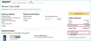
The whole idea of shopping online is to remove the unwanted hassles and get everything at a click of a button. No one would go for online shopping if they don’t get rid of the long queue and waiting hours. Thus, making the checkout process simpler and convenient is the need of the hour. Make the call-to-action on the page clear by removing the clutter. The entire process should be self-explanatory and as precise as possible. One page checkout addon help you manage the fields you want to show in your page and customize the buttons. However, make sure that you keep everything transparent. Do not surprise the users with extra charges and shipping costs.
Minimize the insecurity of checking out
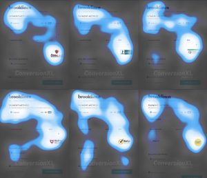
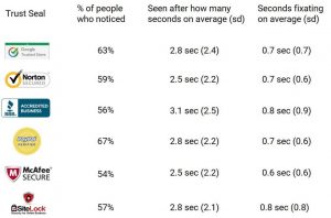
Building the trust factor at the payment gateway is the key to trigger the users to go further. The payment process is a sensitive part of online shopping and users tend to get worried about the security. The trust signals is very obvious, but is not always implemented on the websites. As per an article of conversionxl.com, an eye-tracking test showcased a general pattern of observation on the checkout page. These maps tell us that all trust badges were pretty noticeable.
Img Source: Conversionxl.com
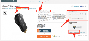
Some of the trust signals that were recommended after the eye-tracking analysis are shown in the image below.
Img Source: Conversionxl.com
Offer refund and replacement option
The money back and replacement guarantee is a must for the users as they don’t get the touch and feel of the products. Reducing the fear associated with online purchases is the essential to reduce abandoned cart and enhance sales. There is always a risk that the product will be returned by the customer, so, return guarantee is a must. Make the entire return process flawless by using an efficient extension. Prestashop Return Manager Addon is one such tool that can manage the return request placed by registered or Guest customer on a PrestaShop store. Thus, it provides you a great way to influence repurchase and revisits.
Make the form quick and easy to fill
As mentioned above, the long and tedious checkout process is the biggest turn off for the customer. The form should be concise and simple. Do not ask for too many information from the customer. The form should be restricted to the front fold only. Online shoppers hate to commit, so, ask for account creation during the payment process.
Get the email address before the person proceeds to the checkout process
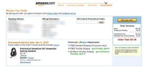
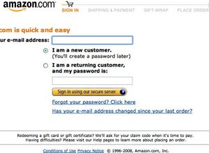
Having mentioned the above point, there is one more factor that needs consideration. The email ids of the shoppers are essential whether he is a registered user or a guest. The reason being even if all the other factor is aligned in the right place, 100% conversion is not guaranteed. So, you need to keep inviting the shoppers with your sales pitches. Ask the user to enter their email address in the starting. They can later choose whether they want to check out as a guest or create an account. This way you’ll get the email ids without even annoying the customer. Use email marketing for the abandoned carts and win more conversions.
Conclusion
Whether you have your own eCommerce store or you have delved into a marketplace scenario, reducing and handling the abandoned cart is the key to boost sales. For the PrestaShop marketplace, you can install PrestaShop marketplace extensions to make the process simpler. Optimize your checkout process and make sure that make sure that your website stands out in the crowd.
Liked This? You’ll Like These Too
- 5 Tips to avoid abandoned carts and win conversions through emails
- How to avoid Cart Abandonment on an eCommerce store?
- How to use Google Analytics for tracking Shopping cart abandonment?
- How to write an abandoned cart email to bounced customers?
- Methods by which you can minimize cart abandonment on your store


