Having an eCommerce website with a pathetic accessibility to its targeted customers is like having a good looking car which does not have a performing engine. Nobody would like to visit a website that takes too much time to load properly and often frustrates a user. If you want to improve the fortunes of your business entity, you need to work towards enhancing your website accessibility for brilliant conversion rates and product sales. With the support of an effective eCommerce website design, seamless site navigation, faster checkout process, impressive website loading time and performance, you can easily achieve the remarkable success in terms of site traffic, conversion rates, customer engagement and product sales. Here is a detailed account of what all ingredients are required for a mind blowing website accessibility.
1. Improve the reach and quality of textual material-
Any website without an impressive and engaging content or text is simply useless. Moreover, the recent Google algorithms like Panda, Hummingbird and others have time and again proved the superiority of the content for generating the required site traffic and conversion rates. Remember to pay adequate attention towards the content as well as graphics or images for increasing the readership of your written content. Take a look at the various ways by which you can accomplish this crucial task seamlessly.
- Use high quality optimized images for increasing the worth and appeal of your written content. Further, use effective image alt tag along with the caption and description for improving the SEO friendliness of your content.
- Offer high quality short videos with your content (Product Video) for making content more appealing and worth while.
- Make use of an effective alternative audio content that does not affect the overall performance and loading time of your website.
- Utilize the services of a plain text transcript or RSS feed for making site content available to large number of visitors.
- Include a closed caption for optimizing the video experience of your targeted customers.
2. Employ ways to read content for your targeted customers-
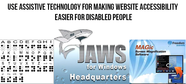
There are numerous people who may not be able to read your site content properly due to visual impairment, small font size or illegible font type of your written text. For ensuring a seamless site accessibility to these type of customers, it is mandatory to have an audio version of your page and site content. This recorded audio file can conveniently convey the written message of your website and its internal pages to your targeted customers. Apart from this, there are various screen reader softwares like Microsoft Narrator, JAWS from Freedom Scientific, VoiceOver for Mac systems, Orca (open source) for Unix based Systems, NVDA (open source), Dolphin Supernova by Dolphin and various such others.
3. Take required steps to improve your site navigation (especially forms)-
What good is of a website if it does not allow visitors to navigate through it in a seamless manner? It would be a sheer wastage of your time, money and efforts if navigating around your website is a challenging task. There can be numerous factors on your site that can act as a major stumbling block in the seamless navigation of your website. You need to give special attention to these particular site elements like registration forms, checkout page, images, videos, links and other such areas for ensuring the effortless navigation of your website.
Among them, forms are said to have a drastic effect on the website performance and navigation. You need to eliminate unnecessary fields, illogical labels and other such factors so that visitors can fill out your site forms without any hiccup. Moreover, you need to avoid time bound restrictions and use correct headings for your content on your website for facilitating a faster navigation. For increasing the accessibility of your site forms, you need to perform the following steps.
- Use a well positioned and descriptive label with each field in your form.
- For establishing an effective relationship between the label text and form field, you can either use a <label> tag or an <ARIA> property.
- Ensure that the tab order of your form is at proper synchronization with the order of the form fields.
- For similar or related fields in a form, you can group them together using the fieldsets. Take for example, fields like “Street Name/Localityâ€, “Village/City†and “State/Province†can be combined together under a single field of “Correspondence addressâ€.
- Inform users about mandatory fields in your form through the help of asterisks symbol (*). Apart from this, you can make desired fields mandatory by using the ARIA property. Use ARIA required=â€true†for mandatory form fields and ARIA required=â€false†if the field is optional in nature.
- Provide customer information regarding successful submission of their form or any submission related errors. Show errors on the relevant place and position on your form for increasing the chances of faster error resolution that can help in the quick form submission.
- Avoid the use of CAPTCHA codes for form validation due to their inaccessibility and performance issues. There are other alternatives like Sweet Captcha, PlayThru, NuCaptcha, client side JavaScript checkboxes and such others that can be used for validating form data. For understanding more about making your forms spam free, you can check out this link.
4. Select the color that is in resonance with your site content, images, backgrounds and other such elements-
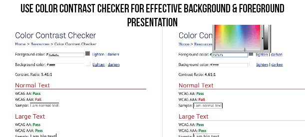
For ensuring the effective readability of your website, it is important to choose the appropriate color for your background and foreground elements. Remember, to use a contrasting color for your text and its background for better accessibility of your website. Beware of using similar colors for both the text and background of your website like using the black text color along with violet, brown or any other dark color will affect the usability of your website to a great extent. The normal contrast ratio while using the color for your background and foreground elements should be around 7:1 but even a contrast ratio of 4.5:1 will also do justice to the visibility of your content and will ensure effective accessibility of your concerned website. You can check the color combination with the help of a/b testing and heatmap tools. By these tools you will be able to know more effective areas and less effective areas and make the required changes on the website.
5. Ensure the proper font size of your content-
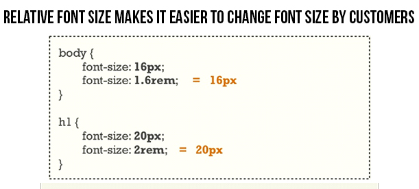
It would be practically immature and naive to expect your readers to have an exceptional eye sight of 6/6 so that they can effortlessly read the small font size content on your website. Don’t make your customers to struggle too much while reading your website content. For facilitating a seamless accessibility to your website content, you need to use relative font sizes that are expressed in terms of percentages or ems rather than using absolute font sizes which are expressed in terms of points or pixels. Due to this above practice, it is practically much easier for the users to make desired changes in the font sizes as per their requirements and eye sight. So, it is the need of the hour to focus on the font size also and not just on improving the visual appeal of your website.
6. Role of Assistive technology in the website accessibility-
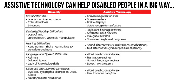
Assistive technology also known as Adaptive technology (AT) is actually a blessing for the people with various types of disabilities linked to visual, speech, cognitive, motor or other such physical and mental disorders for accessing the various areas of a website effortlessly that use precise mouse movement, positioning or clicks. The technology stands for a group of assistive, adaptive and rehabilitative devices that are aimed for people with different disabilities along with the process that is involved in locating, selecting and utilizing these devices. This technology has provided a great sense of freedom to all disabled people through the help of various enhancements that have changed the way by which these people used to interact with various digital devices.
Various devices like screen readers, braille system, screen magnification software, speech recognition software, switch access and other such have done a tremendous job in providing a seamless website accessibility to people with various types of disabilities. For more information about different types of assistive technologies that are acting as guiding light for disabled people, all you need to do is just follow this simple link.
7. Improve the performance and nature of your links-
For directing more number of people on the desired location of your links, make sure that your links are having a proper label and color for indicating your targeted customers about them. Use a more contextual based text than those simple phrases like “click hereâ€, “read moreâ€, “know more†and other such statements that can prompt your targeted customers to click on a particular link. Further, choose the right color for your link for getting higher customer attention and link accessibility.
8. Use HTML for improving the accessibility of your tabular data-
Make it a point to use only HTML for data tables instead of using the images. This approach will be extremely useful for the visitors that are using the assistive technologies for accessing the table content. Moreover, try to include proper column headers for improving the accessibility of your table content. It is also advised not to use tabular format for the page layout or structure as it causes problem in the effective accessing of the content.
For making your data tables more accessible to your users, you need to mark up your table header cells effectively. Apart from this, you need to use the scope attribute value for the associated column header or row header of your table. If you want to improve the accessibility of your “date†field in your table, you need to change <td>Date</td> to <th scope=”col”>Date</th> in your coding part. Further, in order to inform users about your data table, you need to include a relevant description or table caption through the use of <caption> tag. For example,
<table>
<caption>Class Schedule</caption>
<tr>….
9. Check the accessibility of your page through the use of WAVE-
Web Accessibility Evaluation Tool (WAVE) is a remarkable tool that can help web developers in improving the accessibility of their website. This website evaluation tool provides crucial insight and feedback about the accessibility of your page by entering the URL of your web page on the Wave tool home page. If you have any doubts, queries and concerns about this website evaluation tool, do check out this helpful link, https://wave.webaim.org/help. Moreover, first time users that are not familiar with this pioneering website accessibility and evaluation tool can take the help of this link for getting required knowledge about checking the accessibility of their website. Other tools besides WAVE that can be the guiding light for improving your site accessibility are CynthiaSays, Tenon and much more.
10. Work towards making your downloadable content accessible to your targeted customers-
It would be in the interest of your website if you can take the required steps in making your downloadable content on your site like terms and conditions documentation, product use manual, product category specification or any other such document accessible to your interested users. Don’t make them to roam here and there in search of required softwares for accessing a particular document but do ensure to make your downloadable content accessible through common available software. Always use a comma separated or tab delimited files, PDF files and other such formats that do not need any licensed proprietary softwares from the concerned vendor. For making your content accessible through the PDF format, you need to follow the various guidelines that are mentioned in this crucial link, https://webstandards.sonoma-county.org/content.aspx?sid=1014&id=1123.
11. Utilize the services of ARIA landmarks-
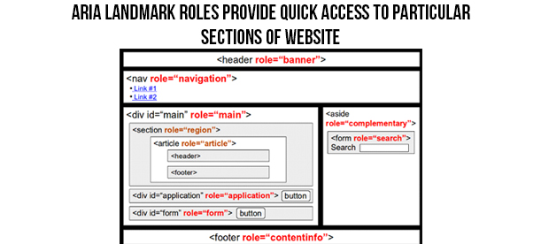
Thanks to the introduction of the new Accessible Rich Internet Applications (ARIA), a specification of the World Wide Web Consortium (W3C) which is a global web governing body, web applications can now be easily interacted and shared through keyboard. You can easily make your site more keyboard navigation friendly through the use of ARIA landmark roles. All, you need to do is just add an HTML attribute for any of the landmark roles, say for example role=â€navigationâ€, role=â€main†or role=â€search†for directing user to the particular section of the page through a single keystroke. Let us check this HTML code that can add the appropriate landmark role attribute on the “main†and “search†section of a website.
<div id=”maincontent” role=”main”>
<form action=”search.php” role=”search”>
12. Learn to use the services of Learning Management Systems (LMS) and Content Management Systems for enhancing accessibility of your website-
For improving the accessibility of your eCommerce website, you need to avail the services of an effective eCommerce platforms that consist of numerous features. Apart from this, you can take the services of various Content Management Systems like WordPress, Joomla, Drupal and others for providing easy access to numerous themes, templates, eCommerce plugins and other such options. Plugins are seen to provide an advanced level of accessibility, performance and usability to a website for improving the overall performance of a website.
However, make sure that you are availing the expertise of an exceptional plugin design and development services like Knowband that has years of experience in this area. Some of the superb plugins provided by it are as follows:
Magento– Some of the amazing Magento extensions that are provided by Knowband are Magento Abandoned Cart, Magento Auto Subscribe, Magento One Page Supercheckout, Magento Google Analytic Enhanced Ecommerce and much more.
OpenCart– Here are some of the OpenCart Extensions that can help in enhancing the productivity of your OpenCart store to a great extent. They are OpenCart Ajax Cart+, OpenCart One Page Supercheckout Pro, OpenCart Social Loginizer, OpenCart Price Alert and such others.
PrestaShop– If you are having a PrestaShop store, these are some of the PrestaShop Addons that can be the game changer for your online store and can improve the accessibility and performance of your website. Take a look at these plugins which are PrestaShop Abandoned Cart, PrestaShop Return Manager, PrestaShop One Page Supercheckout and many others.
13. Improve the reach of your website on various mobile based devices-
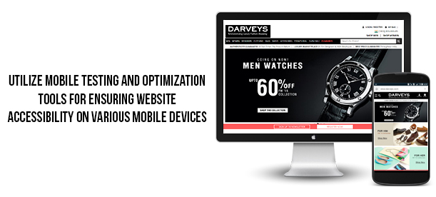
Due to the constant increase in the number of mobile customers, it is the sole responsibility of every online business entity to make its website accessible to various available mobile devices. Use various tools like Mobile Usability, mobile friendly test, PageSpeed Insights, Pingdom website speed test and other mobile SEO tools for improving the performance of your mobile website. If you want to know more about how to improve your mobile SEO results, do visit this informative link. Further, use of the content delivery network (CDN) services along with the webp image format for Google Chrome browser can make a significant effect on the accessibility of your website on various mobile based devices.
14. Make use of proper alt text for images-
Although, it is said that “An image can say a thousand words itself†but these images need the support of Alt text for helping user understand the proper intent or message behind these images. Moreover, these alt text becomes much more useful while using an informative images like infographics. It is to be noted that the message which is to be conveyed with a particular image needs to be used in the alt text of that image. Similarly, if the concerned image consists of some text, that particular text should also be included in the alt text. Make sure the images that are used as links are provided with appropriate alt text so that screen reader can read the associated message of your image rather than reading the file name of your image. Here is the sample code about how an alt attribute can be used in an image for improving its appeal and understanding among the targeted customers.
<img src=”webaimlogo.jpg” alt=”WebAIM – Web Accessibility In Mind”>
However, you can leave the alt text empty for your images if the image is purely used for fancy decoration purposes as it will take the focus of your customers away from the concerned image.
15. Initiate steps to make your website more accessible through keyboard-
There are numerous users that like to navigate a particular website through the use of keyboard shortcut keys or Access keys. These Access keys are HTML elements that are not effectively used during website development process for ensuring a seamless access to certain sections of the website through keyboard. In order to use the services of Access keys, you need to follow these steps.
– Press Function key (Alt in case of Windows and Ctrl if the system is a Mac) along with the specific letter or number key that is associated with a particular section of the website.
Further, programmers can effortlessly add the functionality of Access keys on their website by adding a simple HTML code into the navigation anchor tag of their concerned site. The sample code is as shown below.
<a href=”index.html” accesskey=”1″>Home</a>
However, what limits the usage of Access keys on a global level is that there is no universal set of assigned keys that can be used for implementing the functionality of Access keys on a website. Apart from this, there is no such mechanism by which users can be informed about the keyboard keys that are used as Access keys for navigating around a site. But, there are certain countries like UK where concerned authority has recommended a set of Access keys that can be assigned for a seamless website navigation through keyboard. Here is a list of those Access keys.
S – Skip navigation
1 – Home Page
2 – News/Updates
3 – Site Map
4 – Search
5 – Frequently Asked Questions (F.A.Q)
6 – Help
7 – Complaints Procedure
8 – Terms and Conditions
9 – Feedback Form
10 – Access Key Information
16. Include headings correctly for organizing your content structure-
For a seamless access to your site content, make use of the heading structure. Use HTML heading tags like <h1>, <h2>, <h3> and others at appropriate place in your content for the effective organization of your content and for better readability. Follow the correct order of your headings and keep presentation away from the heading structure through the use of CSS. Some of the guidelines that needs to be followed while creating a new CSS class for your content are as follows.
- Always use <h1> tag for the main title of the page. Keep <h1> heading tag reserved for the title of the website and other individual pages.
- Include headings for the proper indication and organization of your content structure.
- Follow a proper order while using the headlines and never jump from <h1> to <h3> heading tag directly as it gives a sense of feeling to readers that some particular content is missing in the middle.
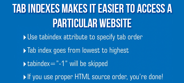
17. Make use of tab indexes for the seamless navigation around your website-
For determing the proper order of navigation around form fields through the use of tab key, it is important to utilize the tab indexes. This feature plays a key role while navigating around the forms on a site. However, if your page design is equipped with proper logical order and a strong hierarchy due to the presence of headings and sub headings, there is not much to worry about this tab index.
As, forms consist of numerous small elements like checkboxes and radio buttons which needs precise mouse positioning and click by humans, performing the same would be difficult for a person with motor disability. In situations like this, life of these people can be in much relief if a proper tab indexing is performed on the form which can enable user to interact with each and every form element through simple keyboard strokes.
Liked This? You’ll Like These Too
- E-Commerce Apps that are a must in this demonetization scenario
- E-Commerce Rebuild- Is it always a good Idea?
- Reasons why your E-commerce Business needs a mobile app
- Some key things to consider while considering the transition towards an E-Commerce Platform
- What information does add- to- cart rates reveal about your E-Commerce Store?

