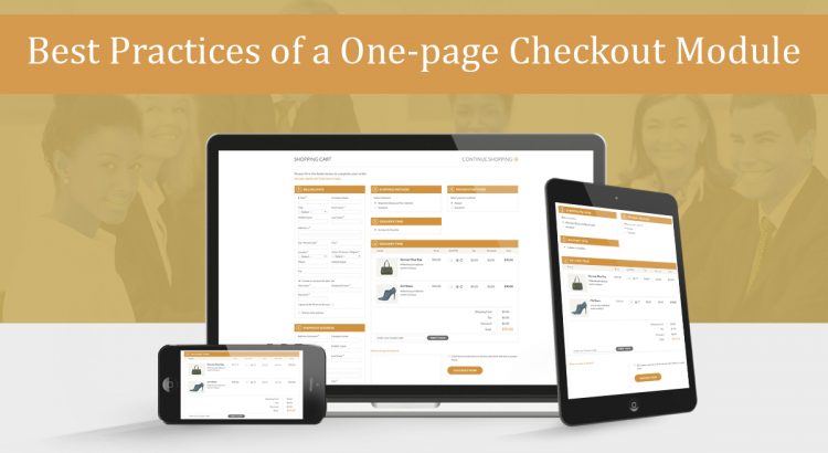
One Page checkout have been in the eCommerce industry for the past few years. However, the kind of eCommerce experience that has been improved using these one step checkouts need not any introduction. From quickest checkouts to conversion optimization, eCommerce store owners see one page checkouts as a tool of improvement. Improvement in customers experiences, improvement in conversion optimization, improvement in competitive advantages against the rivals and much more.
In this article, I am basically going to explain how a perfect one page checkout would look and behave with the customers to provide the eCommerce sites a better checkout page.
Reduced entries in one-page checkouts- A one page checkout is basically adopted to provide the quickest checkout experiences. Sometimes, we get confused between a one step checkout and a quick checkout experience. The line between the two is very thin.
A pure one page checkout module would work by compacting each and every step of a multi step checkout into a single page. From customer information, shipping address, to payment options each and every step is reduced onto a single page.
However, a better quick checkout design would not only consist of a one page checkout but would also show a decrease in number of entries. These reduced entries are obtained by skipping the redundant or unnecessary entries from the generic checkouts.
For example, in generic checkouts, we would find different entries for mobile number and telephone number. In quick checkouts, we might have the option to skip the telephone number and provide only the mobile number in the form.
Designs and layouts-There are basically three types of layouts that are used by the one step checkouts to compact the whole process on one page. The single column, the two column, and the three column layout.
The single column layouts are generally adopted by those sites which do not ask much of the information. This information can be compacted in a single page without increasing the page length. In case if the number of the entries required are much larger, then a two or three column layout is a better option.
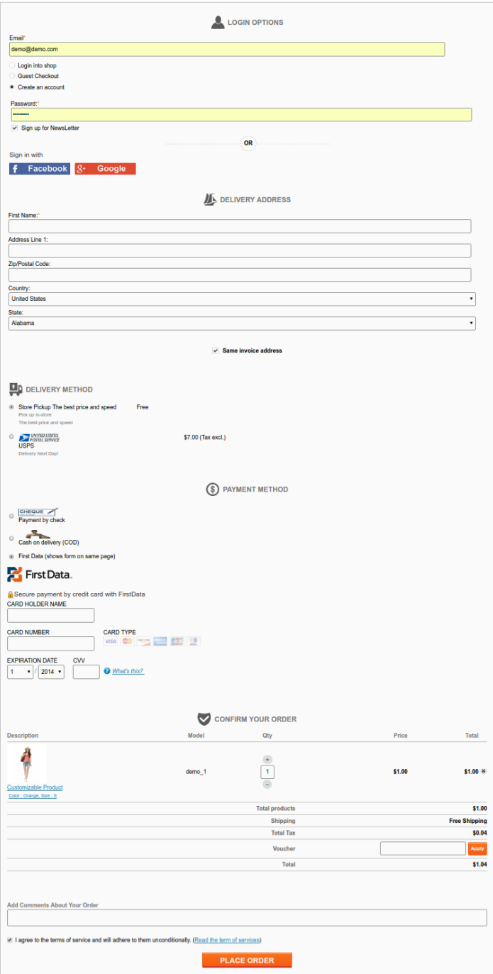
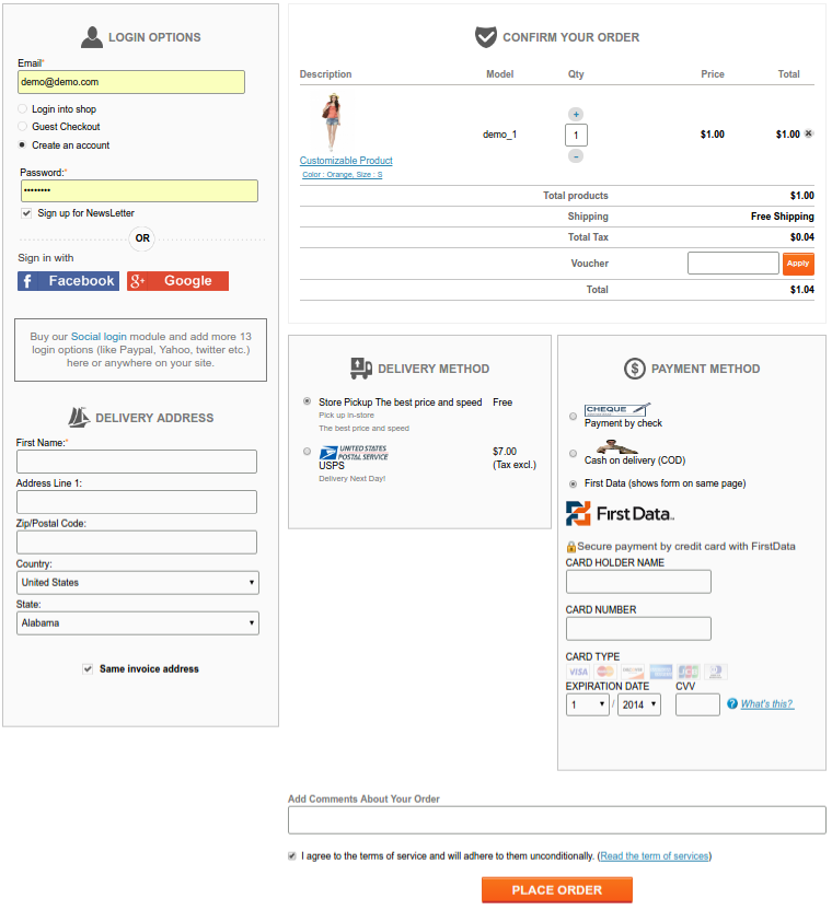
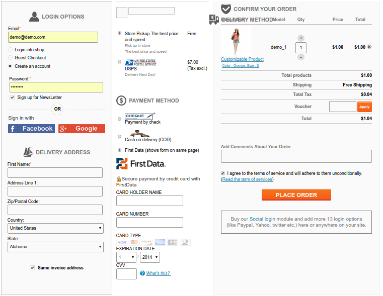
By changing the layout options we can re-arrange the one step checkout to switch the designs and constitute the required fields in a single page accordingly.
Checkout speed and steps- As we know that one page checkout would definitely compact the multi page structure into a single page structure. However, just the compaction of steps is not enough to get a proper one page checkout; at least the customer’s experience will not improve until you work on the speed of the checkout. The checkout speed can be increased by:
- Removing the unwanted or not necessary fields from the checkout page.
- Removing the redundant fields.
- If any field on the checkout page can be helpful but not necessarily required by you, you should make it optional.
- Pre-filling the customer information from the user account.
- Reduced the use of graphics intensive objects like carousels.
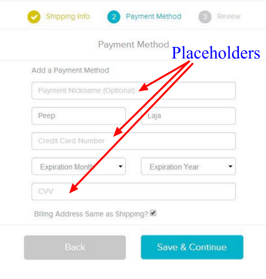
Behavior of fields on checkout page- To reduce the size of the one page checkout and make them conversion friendly, you can skip the labels of text fields and use placeholders instead. However, in some cases, labels are more effective than placeholders. For example, if a checkout form consists of a large number of fields, the user might get confused about the kind of entries he has filled when he reviews the entries afterward.
So, placeholders can be used as a guiding tool to make the fields clearer and it is a better option them using them in place of labels. These placeholders can consist of pre-filled examples.
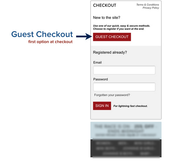
Option of Guest Checkout- There are certain chances that a customer might have come to your online store for the first time and he might not have a user account. A compulsory requirement of sign up would definitely encourage the shopper to abandon your cart. Instead like every effective checkout process, your one page checkout should be able to accept the guest checkouts. The guest checkout just includes the manual entry of email address and customer information. Later on the customer might choose to sign up, but as of now, it would not hamper your conversion at least.
So, like every effective checkout process, you should make sure that your one step checkout is efficiently accepting guest checkouts. It would not only improve your conversion rate but would also help you prevent shopping cart abandonments on your store.
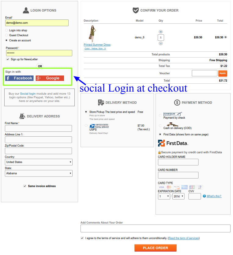
Social login at checkout page-
There are various social Login modules that allow the eCommerce store owners to accept social login on their online stores. These social login options allow the users to login or sign up to a site without a need to fill the registration forms. It is one of the ways adopted by eCommerce store owners for conversion optimizations.
It is a useful feature to include in the one page checkout page too. When a shopper reaches to your checkout pages, he would definitely not want to go back and create an account on your shop first. Instead, you can allow the shopper to use his/her Facebook, Gmail or PayPal account to register on the store. Once the shopper sign-ups using the social login, he would be again directed back to the one step checkout page and can continue from the same.
Every one page checkout is adopted by the online store owners to improve their sales and conversions. If it goes wrong, it will result in nothing and would destroy the customers experience in addition. Choose a one step checkout module that has at least these basic features. For PrestaShop, OpenCart and Magento stores, Knowband provides effective one page checkout modules that include all of the above-discussed features and much more.
Related Stories:

