Did you ever go to any fashion store and started walking out later without purchasing anything because you couldn’t find what you were looking for or the price was too high?
This has happened with almost everyone.
And as soon as the shopkeeper realized that you are on your way without purchasing anything, he tries to stop you either with some discount game or some offers. Sometimes, you agree and sometimes you don’t.
This is exactly what an Exit Pop up does in eCommerce. A majority of the online businesses leverage exit pop-ups to increase conversions on their website.
What is an Exit Pop up?
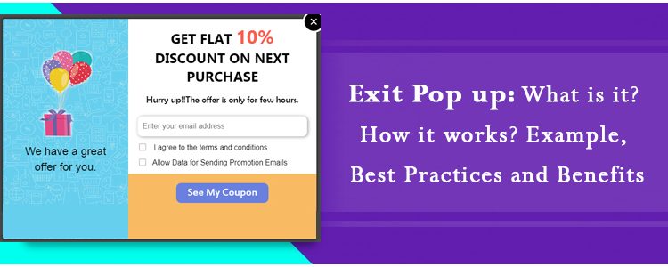
An exit popup also referred to as an exit-intent pop up is a popup that appears on a visitor’s screen when they intend to take an exit from your website. It is basically a last-minute effort made by website owners to stop visitors from leaving.
For example, if a user is trying to leave your website after abandoning the cart, you can make an attempt and try making him stay and complete that purchase by displaying some enticing offers through the exit pop up.
I usually find exit pop-ups better than any other kind of popup, the reason being they do not irk visitors. They do not disturb the flow and are displayed only when a visitor tries to exit.
Exit popups ensure that the user experience is maintained until the very last moment, unlike other popups that can appear at any point of time.
How does an Exit pop up work?
The exit popup or the exit-intent technology tracks the mouse movement of the visitors and triggers the popup when it captures that the user is heading towards the exit button. It is usually in the form of an overlay pop up.
One thing to mention here is that the popup is not displayed only when the cursor has moved towards the exit button, it is triggered when the user leaves the browsing area.
An exit popup is not always used to display offers. You can customize it as per your requirements depending on what actions do you want your visitors to take after seeing it or what results do you want to achieve through it.
Exit Popup Examples
Through an exit intent pop up, website owners primarily aim to capture the email address of the visitors so that they remain in touch with the brand and are often brought back on the website. Brands then try to build communication over email and persuade the subscribers to become their customer.
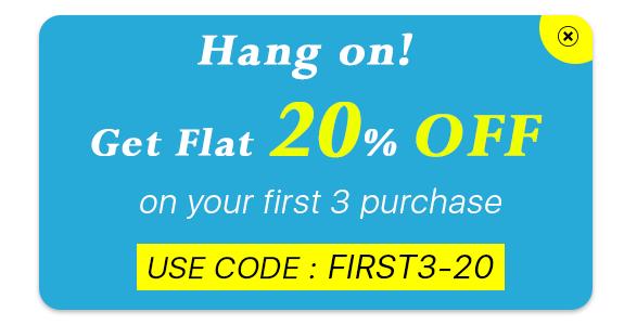
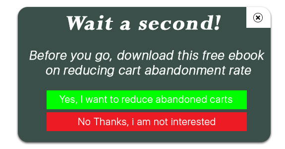
In most of the cases, an exit popup is used in two ways-
1. To induce visitors to make a purchase using an exclusive coupon code
2. To make visitors download a free guide or an eBook
Exit Pop up Best Practices
Let’s take a look at some of the best practices for an exit popup to achieve good results.
1. Provide Irresistible Offers
The best way to stop your visitors from leaving your website is by offering them something which they can’t resist to grab.
Offer something exciting. It should be worth their attention and should encourage them to claim that offer instantly. If the offer doesn’t excite them, the pop up will fail to bring conversions.
2. Make it Visually Appealing
If you want to make an impact with the exit intent pop up, make sure it is highly appealing and designed in such a way that users are not disturbed by it and feel the need to check it out even when they have decided to leave.
Use attractive colour combinations, pay attention to what font you are using, write tempting content and most importantly, make your CTA, i.e. call to action stand out. Do not use common CTAs like Sign Up or Subscribe, use the ones that create urgency.
3. Use it to Collect Feedback
Exit Popups are also used to collect the feedback of the visitors. Ask them if they have any suggestions to provide or have any complaints or anything that they feel is missing or needs to be improved.
Benefits of an Exit Popup
An exit pop up provides you with some amazing benefits.
1. Boost Conversions
No other pop up draws the visitor’s attention as much as an Exit Pop up. The effectiveness of pop up doubles when it is displayed to the user when they are only focused on taking an exit. It is not the same when the user is browsing some stuff and is interrupted by a pop-up.
Through exit popups, you can reduce the cart abandonment possibility and eventually increase your conversions.
2. Reduce Bounce Rate
If a user lands on your website and does not find anything helpful, most likely they will bounce off. And while they try to leave, an exit pop up could be of some help and it can encourage them to check out your website.
3. Exit Popups are not annoying (Usually)
Pop-ups have mostly been an annoyance for users. They hamper the user experience. But this is not the case with Exit Popups because they appear only when the user has already decided to leave your website and there is no harm in making a try to stop them from leaving.
Exit Pop up Module by KnowBand
The Exit Pop up module by KnowBand is a feature-packed module that allows you to make tons of customizations to the pop-up and adjust the popup functionality. For example, you can set up the pop-up frequency, hide the pop up after a few seconds automatically, and do much more.
The interesting thing about this module is that it not only works as an exit pop up but also as entry pop up. You have the option to disable it anytime and can use it particularly when users try to exit. Check out-
OpenCart Exit Pop up Extension
Magento 2 Exit Pop up Extension
If you need any assistance in the mentioned modules, you can reach out to us at support@knowband.com
You may also like:
Trigger Impulse Buying with PrestaShop Exit Popup Addon
8 Email Popup Best Practices to Grow Email List and Boost Conversions


