This article revolves around Checkout optimization and provides you with 11 effective ways to optimize your eCommerce Checkout and bring more conversions.
Out of all the elements in an eCommerce website, the checkout page surpasses every other factor in terms of importance. It is the page that brings you conversions or you can say it is the place where visitors turn into customers.
Your website might have an attractive layout and a user-friendly interface. You may even have a wide range of products but it is only good enough to increase the traffic to your website. Yes, it is important but none of it matters if the high percentage of your website traffic is not making it past the checkout page.
Simply expressed, it refers to a high cart abandonment rate, which shows that customers are adding things to their carts but then declining to purchase once they reach the checkout stage.
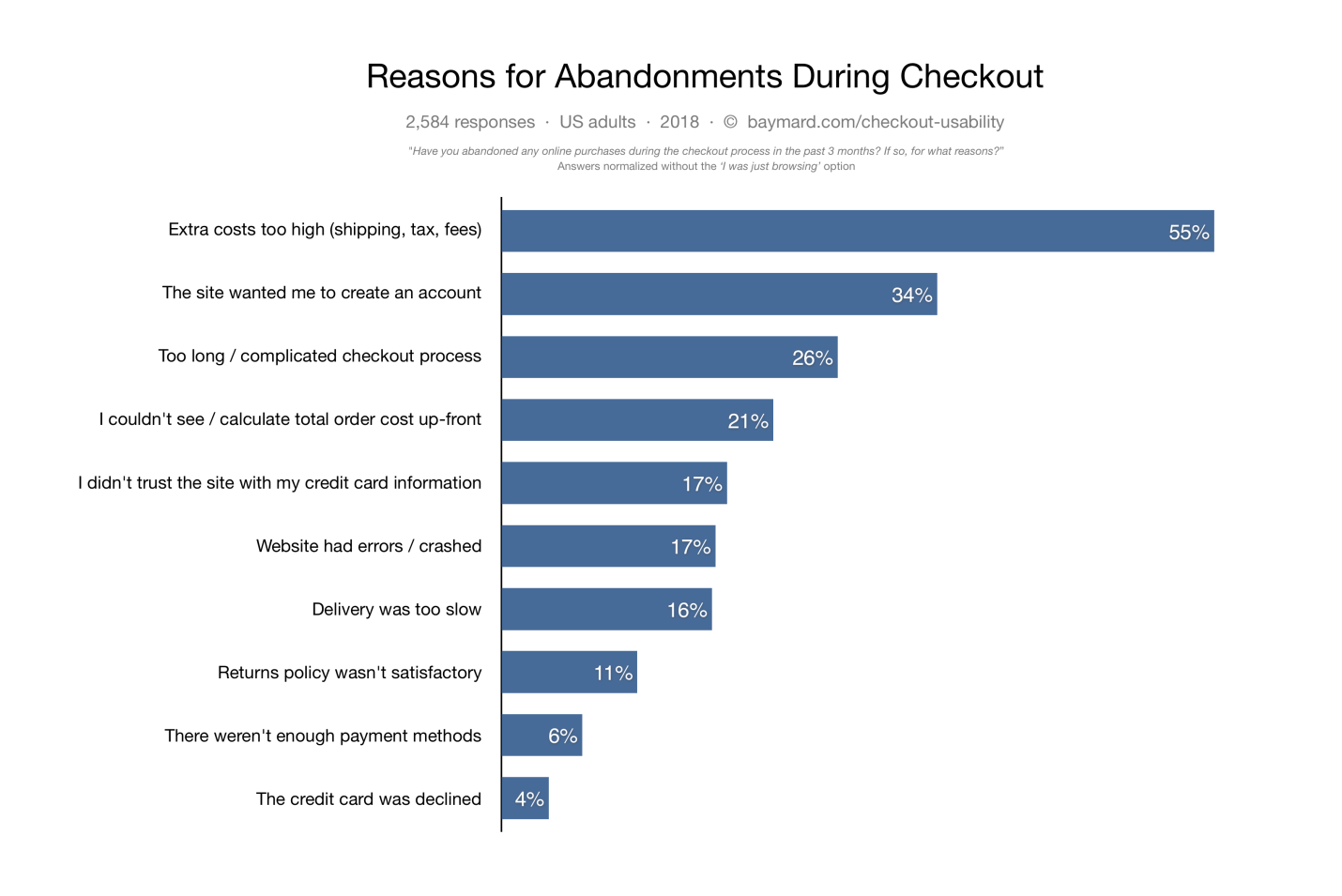
Cart abandonment can have multiple reasons. According to data gathered by the Baymard Institute, some of the causes of cart abandonment are listed below.
Did you know the average cart abandonment rate is 70%? Every 7 out of 10 customers abandon their cart for some reason. The percentage reflects that e-retailers lose out on huge sales due to shopping cart abandonment.
The best approach to reducing cart abandonment and increasing conversions is optimizing your checkout page, and this is what I am going to cover today.
In this article, I will suggest the top 11 best checkout page optimization practices to recover your lost sales.
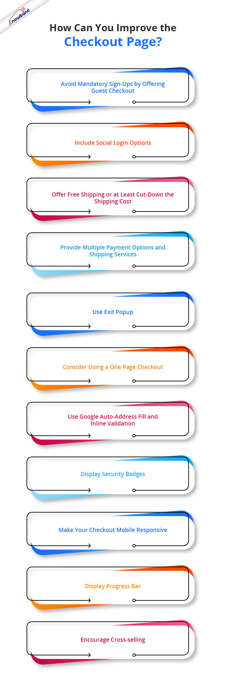
How to optimize your Checkout page?
To contribute to a smooth checkout process and provide your customers with a seamless checkout experience, consider the below-mentioned eCommerce checkout best practices.
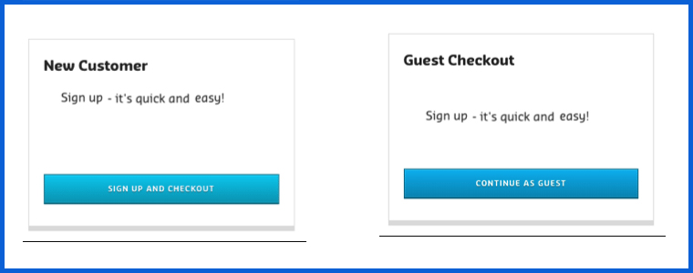
1. Avoid mandatory sign-ups by offering Guest Checkout
If we look from a merchant’s point of view, it is quite understandable that they want to obtain customer data for their marketing campaigns but they also need to understand that not everyone wants to be a part of their campaigns, promotions or newsletters.
The percentage of such customers might be low, but it does make an impact on your sales.
So, skip the mandatory registration process and provide a Guest Checkout facility on your eCommerce website, avoiding the need to create an account. It is one of the best practices for eCommerce checkout optimization.
2. Include Social Login options
While some visitors do not want to register, some feel reluctant to sign-up. The checkout flow is broken and the customer experience is hampered when a registration form is displayed on the checkout page.
Since some websites follow a lengthy registration process, it might compel the visitors to abandon their cart and leave the store.
You can help such visitors by offering them the social login facility, basically something like Facebook login and Google login.
Social login paves the way for a quick checkout by speeding up the registration process, and it also maintains the checkout flow.
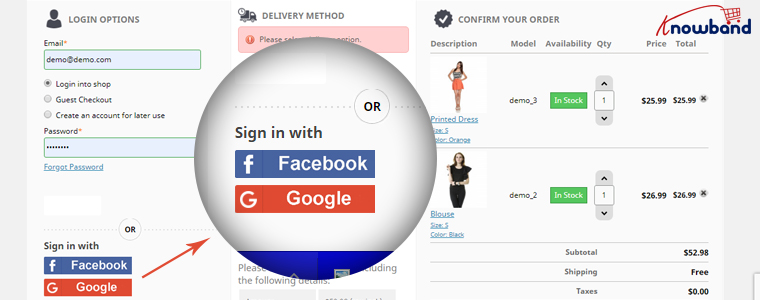
It is a single-click registration, considering that the visitor is already logged in to the social network he or she is using to sign in on the website.
Social login is among the effective checkout optimization strategy.
You can try out our Social Loginizer module if you want to offer multiple social login options to your visitors. It offers up to 15 social login options.
The Social Loginizer module is available for PrestaShop, OpenCart, and Magento 2. Check out-
This might also interest you:
Recommended Blogs: 10 Benefits of Social Login in eCommerce
3. Offer Free Shipping or at least cut down the shipping cost
Another eCommerce checkout optimization practice would be to provide a free shipping facility to the customers.
High shipping cost has remained to be a disappointment for online shoppers and it is to be of no doubt why it is the major reason for shopping cart abandonment in Baymard’s study.
The extra added amount at the final checkout step unwillingly forces customers to abandon their cart. Some e-commerce stores charge a heavy shipping amount and it is enough to turn away the interest of the customer from the purchase.
To reduce the possibility of cart abandonment and persuade prospects to make a purchase, offering free shipping can be an ideal way.
Free shipping can surely enhance the chances of conversion. It gives customers a sense of joy when the product amount remains the same throughout.
And you do not need to compromise on your profit. You can slightly adjust the product price to absorb the shipping cost.
PrestaShop website owners can try out our Free Shipping Manager and set up their shipping rules to provide free shipping.
Related: Free Shipping Strategies: Why to offer? What to offer? When to offer?
4. Provide Multiple Payment Options and Shipping Services
Adding to the checkout page best practices is to expand your payment and shipping options.
Around 6% of the online shoppers abandon the checkout page due to the lack of payment modes and some 4% are left with no choice but to purchase as their credit card gets declined. So approximately, 10% of the people are having payment-related issues.
It can be overcome by offering multiple payment options. It is also important because different customers have their trust attached to different payment modes.
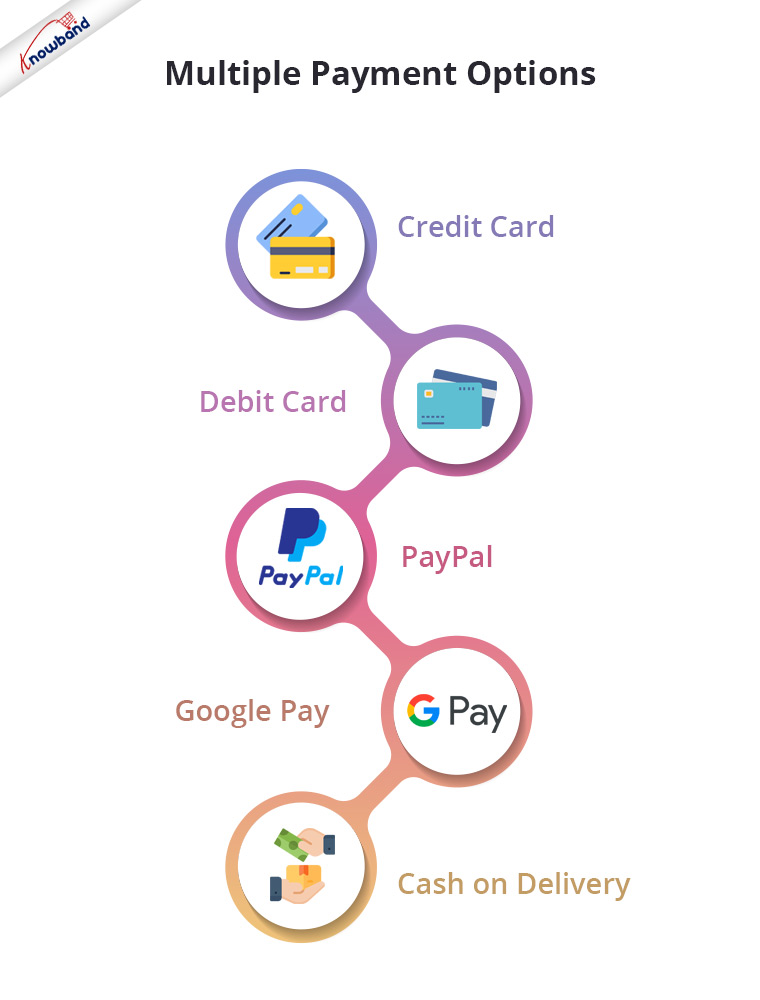
So, let the people choose their desired payment mode from a variety of payment options. It will result in a higher conversion rate. Apart from Credit Card and Debit Card, you must include digital wallets like PayPal, Google Pay, etc. and Cash on Delivery.
Similarly, you should provide people with multiple shipping services. Different shipping stores have different delivery times, so let the users decide how quickly they want their item to get delivered.
Some shipping service providers even guarantee a 1-day delivery and this can be very helpful, especially for a user who wants to receive his/her order within 24 hours.
5. Use Exit Popup
Another checkout optimization tactic would be enticing the shoppers with some attractive offers and discounts when they are about to leave your website after almost making it through the entire checkout process.
Even when you are unable to pinpoint the precise reason why the user is leaving the checkout page, you should try your hardest right up until the very end to persuade them to make a purchase.
It can be done by using the Exit popup functionality. It tracks the mouse movement of the user and displays your store offers as soon as the user intends to take an exit.
Try out Knowband’s Exit Popup. It is a feature-rich module that has so much to offer to make your popup effective. Most importantly, you can enable the exit popup functionality for multiple pages, not just for the checkout page. Check out-
6. Consider using a One Page Checkout
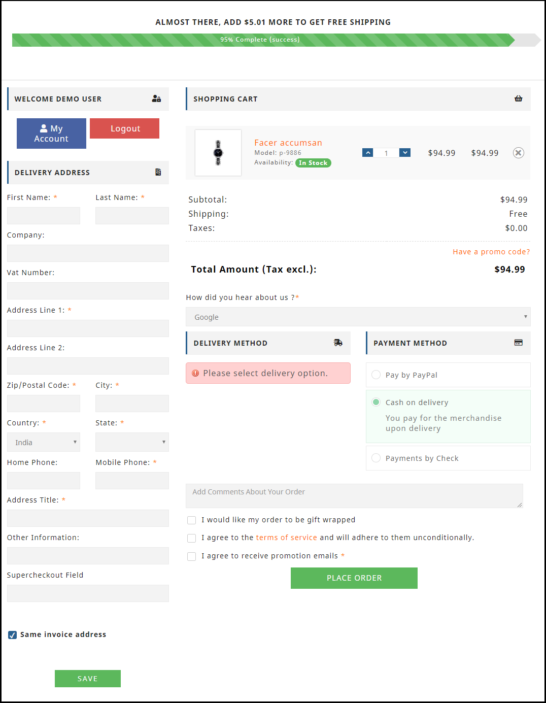
One of the best ways to optimize your checkout process is by implementing a Page Checkout on your website, also called a single page checkout.
This checkout optimization simplifies the checkout process by placing all the checkout fields on a single page. It offers an easy, fast and convenient checkout, and results in a better conversion rate.
I am not undermining the multi-page checkout process but I feel One Page Checkout has a slight upper hand over the multi-step checkout.
To know the in-depth analysis of both the checkout processes, read:
One Page Checkout vs Multi-Page Checkout
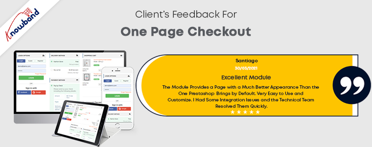
Our One Page Checkout module offers Guest Checkout, Social Login (Facebook, Google and PayPal), supports multiple payment methods and shipping services, and whatnot.
It is a perfect solution to all your checkout problems. We have-
One Page Checkout for PrestaShop
OpenCart One Page Advanced Checkout
One Page Checkout for Magento 2
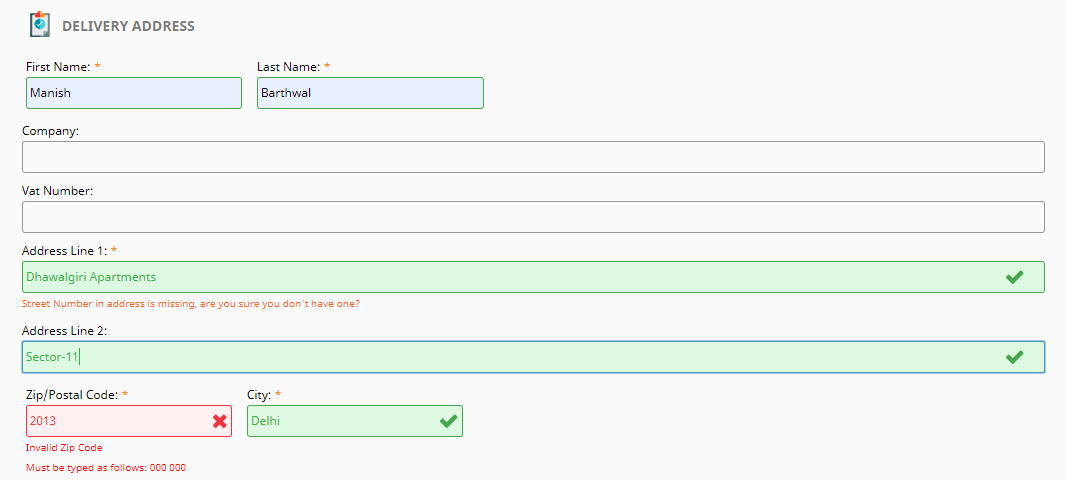
7. Use Google Auto-address fill and Inline Validation
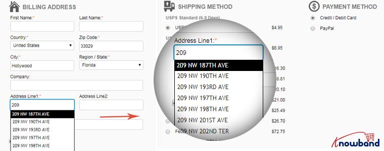
Save users’ time and allow them to check out quickly by enabling the Google Auto-address to full functionality on your website.
It displays the address suggestions as soon as the visitor types his/her address in the address field. Upon picking up an address, the rest of the address fields are filled automatically.
You should also include the option to use the shipping address for the billing address as well.
Along with autofill, enable Inline Validation(also called Data validation). It helps a user to identify the mistake while putting up the details on the checkout fields. When the user switches between fields, it checks whether the inputs provided by the user are correct or not.
Both of these methods play a crucial part in eCommerce checkout optimization.
8. Display Security Badges
People often doubt the security level of a website, especially new visitors. They do not trust a site easily and hence they feel a bit of concern when providing their payment details.

Make visitors feel that your website is trustworthy and their payments are secured. Display them the trust seals. It can include the logos of the payment options, security badges from Norton, McAfee, Padlocks, or even a short text that reads “Fast and secure payment”.
You must also add an SSL Certificate to your website to maintain the trust throughout.
9. Make your Checkout Mobile Responsive
Today, most people prefer to do online shopping via their mobile devices.
According to a report by Statista, 72.9% of all retail e-commerce is expected to be generated via m-commerce, by 2021 and this is the main reason why online businesses are paying more focus towards convenient mobile browsing to ensure their visitors enjoy a seamless checkout experience not only from desktop but also from a hand-held device.
So, make sure your checkout page is mobile responsive if you want to gain high conversions from mobile devices.
A mobile-friendly checkout page is an essential factor in checkout page optimization.
10. Display Progress Bar
Though I suggested above to have a one-page checkout, you can continue with the multi-step checkout process if you aren’t a fan of a single-page checkout but make sure it displays a progress bar.
A lengthy checkout process can often irk users if they have no idea how long the checkout process is going to take.
Help them by displaying a progress bar/progress indicator so that it is clear beforehand what steps they need to go through to complete the checkout.
People are less likely to abandon the checkout page if they can see their checkout progress.
11. Encourage Cross-selling
When you talk about checkout optimization, cross-selling can never be neglected. Right after the user makes a purchase, display their related products that would go well with their purchase.
Besides, you can at least encourage customers to shop for more by thanking them and providing them with a coupon code for their next purchase.
Related: A complete guide to Cross-selling and Upselling in eCommerce
The Bottom Line
Optimization of checkout pages is not limited to a few set tactics. You will find plenty of ways to optimize your checkout page, however, I found the above-suggested methods to be the most helpful but it is not as easy as it seems.
Checkout optimization takes a lot of effort and time. You need to keep doing A/B testing at regular intervals to identify what works out the best for you.
Remember even a slight decrement in the abandoned carts can add up a huge amount to your total revenue.
That’s it. If you liked these 11 Checkout Page Optimization best practices. Feel free to add any point which you feel can help in providing a seamless checkout experience.
For any assistance regarding the module functionality, you can reach out to us at support@knowband.com





Loved each and every point of this checkout page optimization guide. Thanks a lot, Manish. This was worth a read.
Glad that you liked it, Andrew 🙂
Very informative article. I was looking for some effective ideas to optimize the checkout page of my ecommerce website and I landed on this. Thanks for sharing this helpful content piece, Manish.
Hey Andrew, Glad to hear that you liked the content and it was helpful for you.