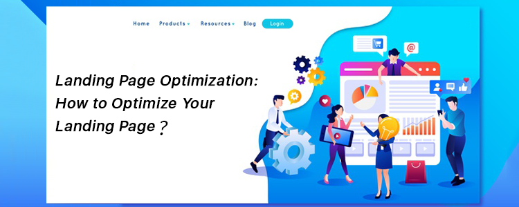
How do I optimize my landing page? What are the best ways to do it? What exactly is landing page optimization?
If you have these questions running through your mind, you have landed at the right place to get answers to these questions.
What is a Landing Page?
Marketers define a landing page in many ways. Some say it is a conversion page that aims to converts visitors into leads while some call it a destination page where the visitors land when they click on a promoted link, be it through Email, Google search results or social media.
Put simply, a landing page is a web page that is designed to make visitors take a certain action. It could be about making them download an eBook, getting them enrolled in a course, or it could be normal sign-up page.
The landing page usually contains form fields such as the name and email address along with the communication message that speaks about the purpose of that landing page.
Landing pages are free from other website elements so that the visitors are not distracted from the purpose and their attention remains on the landing page. Most of the landing pages are plain simple pages with a nice solid background; hiding distractions like the navigation bar, footer, etc.
What is Landing Page Optimization?
As the words indicate, Landing Page Optimization means optimizing the elements of your landing page to get more conversions/leads. It is needed when you are getting a lot of visits on the landing page but the conversions are not happening.
So you pay focus to the elements and design it or say enhance it not only to maximize the conversion rate but also to improve the user experience.
6 Tips to Optimize your Landing Page
When designing a landing page, keep the following points in mind-
1. Keep It Simple
Do not clutter your landing page with unnecessary elements. When you fill it up with too much text and colors, it does not look pleasing at all, and doing so might compel visitors to bounce off from that landing page straightaway.
Keep it as simple as you can and try to put the entire focus of the users on the call to action.
2. Less Text, More Impact
You need to be very creative with the words that you are using to get their attention. They should be persuading enough to achieve the results that you are expecting.
A simple one-liner can be more powerful than long texts. It just depends on how strong your convincing power is. Use less text but make sure it leaves a significant impact.
Highlight the benefits/offers. When you are designing a landing page, the first thing to give a thought to is how you are going to make customers feel that it can add value to them. You need to build the excitement and at the same time, be a kind of an influencer to push them to grab what you are offering.
3. Use Triggering Call-to-Action
Your call-to-action plays the most important role in your landing page. It should be clearly visible and hit the visitor’s eyes as soon as they enter the landing page.
Using triggering CTAs like “Get my eBook now”, “Download Now”, Claim my offer” can be more effective than other normal CTAs like “Sign Up”, “Learn More,” etc.
The color of your call-to-action is something you simply cannot overlook. Use colors that are pleasing to the eyes and display the CTA text in a crystal clear manner.
Not only does the CTA, but the color of your landing page also has a vital role to play in your conversions. Use contrasting colors that fit well with the text. Besides, keep everything spacious.
4. Develop Curiosity
You would have often seen marketers using phrases like “Limited Time Offer” or “Limited Grabs Available” or “Valid only for first XXX customers”. There is a reason why these terms are so successful in bringing positive results. When you use such terms, visitors act quickly as they know they might miss out on that opportunity later. They want to grab it before it expires.
You could also try adding a countdown timer and let visitors know how much time they have before the offer ends.
5. Use Exit Popups
Adding to our list of Landing Page optimization practices is using Exit Popups. Having an exit popup on your landing page provides you with one more opportunity to convert a visitor. So you can say it is like a Plan B of your Landing Page Conversion strategy. If Plan A does not work, plan B might.
An exit popup appears when a website visitor intends to leave the web page he or she is present at. They are more effective and less irking than other popups that could appear anytime and break the flow of the visitor.
Knowband also provides the Exit Popup module for PrestaShop, OpenCart, Magento and Magento 2 that lets you customize your popup and adjust its functionality as per your requirements.
6. Keep doing A/B Testing
It’s important to keep doing A/B testing of your landing pages as they would help you understand what kind of a landing page your visitors are more inclined to and what sort of changes you can make to optimize it further for better results.
If you do not perform A/B testing, you would not be able to clearly identify what’s lacking in your landing page even if you made it perfect from your end.
Final Word
Landing page optimization would not happen in an hour or a day and it cannot bring you results overnight. You will have to look from a user’s point of view and understand if it is good enough to bring you conversions.
Consider these 5 Landing Page Optimization tips and let me know if it worked for you.
What’s your landing page optimization strategy?


