You would have often visited malls for shopping purpose. What did you look for after picking up your items? I am sure your eyes would have been searching for a short checkout line so that you could make a quick checkout.
Let me tell you my case, I went to a store a few days back, picked up some stuff and when it was time to go to the billing counter, I noticed the line was too long. I waited for a few minutes initially but couldn’t keep the patience for long. I left my items there and took an exit from the store.
In e-commerce, this is what we call as Cart Abandonment and a lengthy checkout process is one of the primary reasons for it. This is exactly what happened in my case too. When I realized the checkout would take a lot of time, I dropped the purchase idea.
This is why a simplified and a user-friendly checkout holds very high importance in the eCommerce space. When users find a checkout process lengthy or time-consuming, they abandon their cart and look for better alternatives.
Getting shoppers to your eCommerce store is not difficult, engaging them till the final payment process without disturbing the user experience, is. The checkout page is the most important part of this whole engagement game.
Through this article, I will enlighten you on how to optimize the checkout process and create a user-friendly checkout.
1. Make Account Registration Optional or at least Offer Social Login
Avoiding compulsory account creation is the primary step towards a user-friendly checkout. Do not compel users to signup when they look almost set to make the payment. Making registration process compulsory at the checkout page mostly results in cart abandonment, which causes high conversion loss.
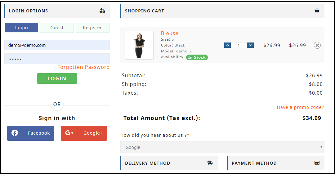
Let the mandatory sign up process not be a hurdle in a successful conversion. Offer Guest checkout or introduce a Social Login option on the checkout page. This would help users in a quick checkout without hampering the checkout experience.
Read: 10 Benefits of Social Login in eCommerce
2. Allow Customers to Easily Update the cart
In many of the eCommerce websites, there is no option to update the product quantity right from the checkout page. Hence, if a customer wants to increase or decrease the product quantity, it leaves them with no choice except discarding their current checkout process, going back to the product page, updating the quantity and filling out the entire details again. This spoils the user experience.
So, make sure that you include the option to update the product quantity on the checkout page. Also, ensure that the back button takes the user to the previous page rather than discarding all their information.
3. Add a One Page Checkout
A one-page checkout also called as a single page checkout is also one of the important elements of a user-friendly checkout. Instead of asking users to navigate through multiple steps to fill the checkout form, make it a single step checkout process. It improves user experience, reduces the chances of cart abandonment and eventually leads to increased conversions.
Read: One Page Checkout vs Multi Page Checkout: Which is better and why?
Look out for Knowband’s One Page Checkout for PrestaShop, OpenCart One Page Checkout, Magento One Page Checkout, Magento 2 One Page Checkout.
Our One Page Checkout module incorporates all the checkout fields on a single page and helps merchants to allow a quick checkout facility to their customers. The module offers Guest Checkout, Social Login, Multiple Layout Designs, etc. Most importantly, it supports nearly all the major payment methods and shipping services.
4. Display the errors up-front
Mistakes happen very often while filling out the checkout fields and customers are not aware of it until they hit the submit button. They have to submit again and again until the entered inputs are found to be correct. This can be extremely frustrating and become a major barrier in a user-friendly checkout.
Use Inline Validation to counter this hurdle. It identified the inputs in real-time and displays whether the provided details are correct or not when the user switches from one field to another.
5. Display Checkout Progress
Use a progress bar to indicate at which step the customer is present and how many more steps does he or she need to go through before finally placing their order. It is always a good idea to keep visitors updated about their checkout progress.
Many a time, shoppers leave the purchase incomplete because they get tired of filling out the information when they are not aware of the checkout progress. So, give them a clear idea up-front of the number of steps that are needed to make through the checkout.
6. Provide Real-time Customer Support
Customers can have a lot of queries while they are on the checkout page, especially the new visitors. You never know what’s going through a customer’s mind during the purchase.
To assist them with their queries or help them with any trouble they are facing, provide them with real-time support. Adding a live chat option or customer support number would do a great job.
7. Thank Your Customers for Shopping with Your Brand
Leave a “Thank You” note for your customers as soon as they place their order along with the “Order Successful” message, obviously. This is a good sign to appreciate or thank your customers for showing trust in your brand. It improves customer loyalty.
Knowband provides “Better Thank You Page” module that converts a normal order success page into an effective marketing strategy. With the help of this module, the admin can encourage repeat purchases and improve customer retention by offering discounts to their customers for future purchase. It also encourages cross-selling.
Checkout PrestaShop Better Thank You Page, OpenCart Better Thank You Page, Magento Better Thank You Page
That’s all for a user-friendly checkout.
The Bottom Line
The journey from adding the product to the cart to the payment page needs to be smooth and convenient. Having a user-friendly checkout not only ensures more conversions but also keeps you ahead of your competitors. All that a customer craves for is a smooth checkout experience, provide them that.
If you find the above information helpful or have anything to add for a user-friendly checkout, do let me know in the comments below.
Moreover, you can visit our Knowband store and look for a number of checkout modules to help you with an optimized checkout process.
Related Stories:
Top 10 Checkout Page Optimization Practices to Increase Conversions
7 Crucial Tips for a Smooth Checkout Process
8 Checkout Page Mistakes that may be Killing your Conversions


