An organized and structured checkout page can help you reduces the checkout bounce rate and cart abandonment. Multiple reasons affect the final checkout and cause you potential buyers and revenue loss. This article is a guide for eCommerce sellers to use their One Page Checkout page in the best possible manner. We have gathered some of the best examples that are using PrestaShop One Page Checkout for Poland eCommerce and making the best out of it. Let us understand why we need a smooth and customizable checkout page by understanding the common issues.
Common checkout page problems and their solutions
It is always a tedious task to figure out a problem on your website that is responsible for driving customers away from your online store. Some of these issues are:
- A clumsy page with unnecessary fields
- Mandatory sign-up that takes several minutes
- Limited Payment options
- Not offering suitable shipping methods
- Poor UI and slow loading pages
These checkout page snags are faced by every eCommerce store owner but when it comes to a problem there is always a solution!
Some of the Poland-based stores have overcome these barriers using One Page checkout on their PrestaShop store. Let’s see how it works!
Social Login and Guest Checkout
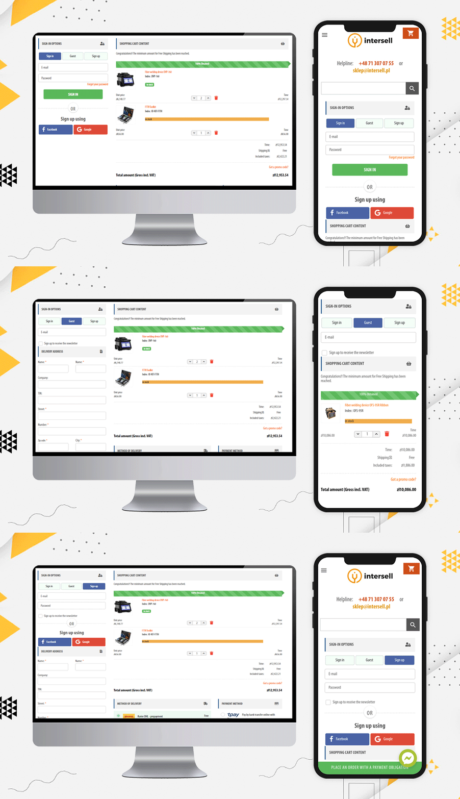
The InterSell
Any website asking for mandatory registration and sign-up faces a lot of abandoned carts. The Poland-based eCommerce store, the Inter Sell is working in the ICT equipment market and they are using PrestaShop One Page Checkout for the checkout process.
The main reason for highlighting this website is its easy Sign-up and login options. To the frequent buyers, they are offering guest checkout and social login via Facebook and Google+ options.
It is easy to track the abandoned cart from the backend of this module and it gives the store owner a detailed report as well. The checkout page supports all the popular payment methods and shipping methods.
Customized Layout design
Poland has a lot of potential in eCommerce and will flourish remarkably in the coming years. Let’s see some checkout page examples that has a wonderful design and customized layout:
The layout of this PrestaShop One Page Checkout is unique. They have been using a single column view and as you move forward in the checkout process, you can observe a 2-column layout.
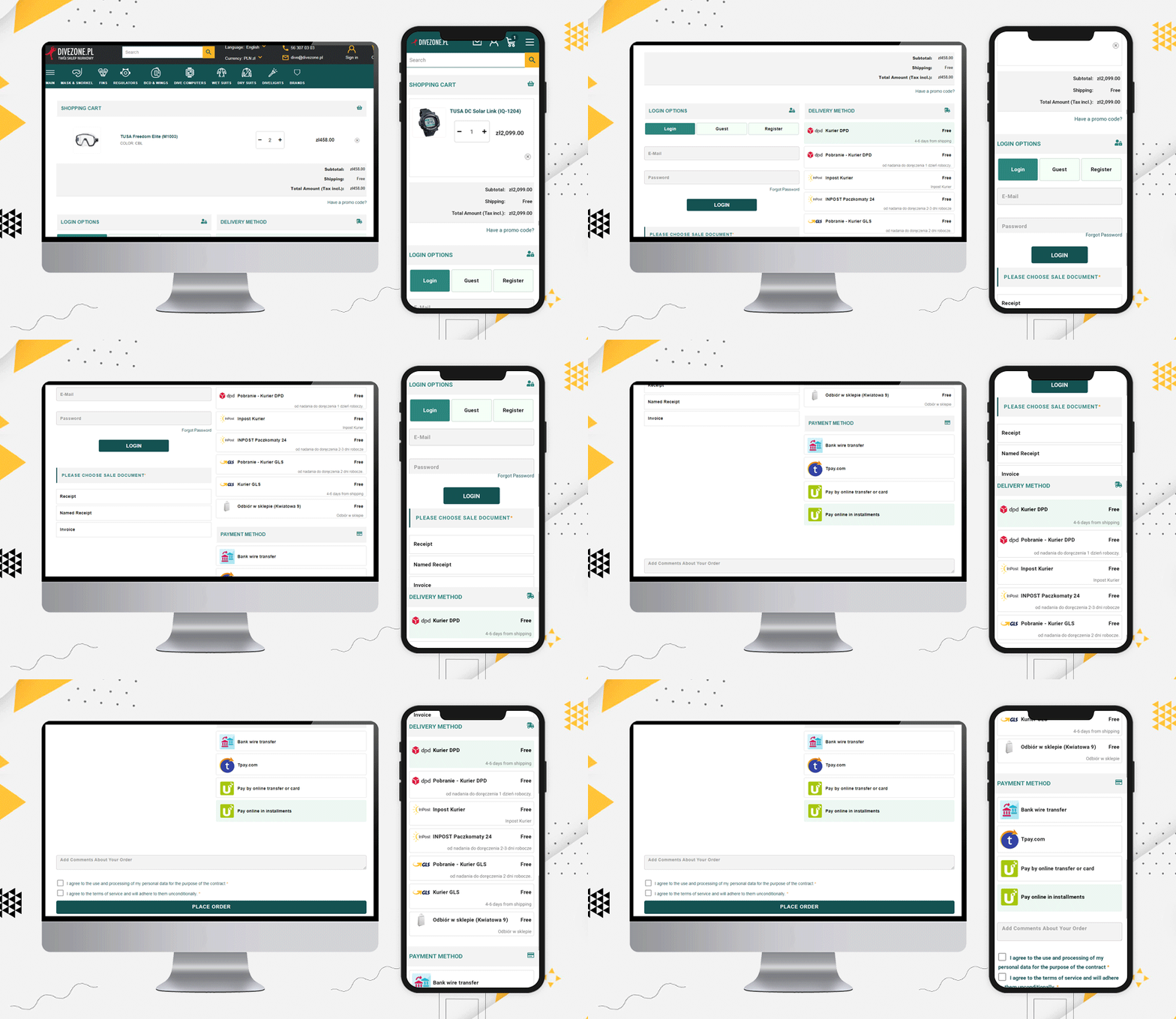
Dive Zone
The Poland store Dive Zone is offering more than 7 shipping methods along with 5 payment methods including TPay, PayU, Bank transfer, Card payments, and Cash On Delivery option.
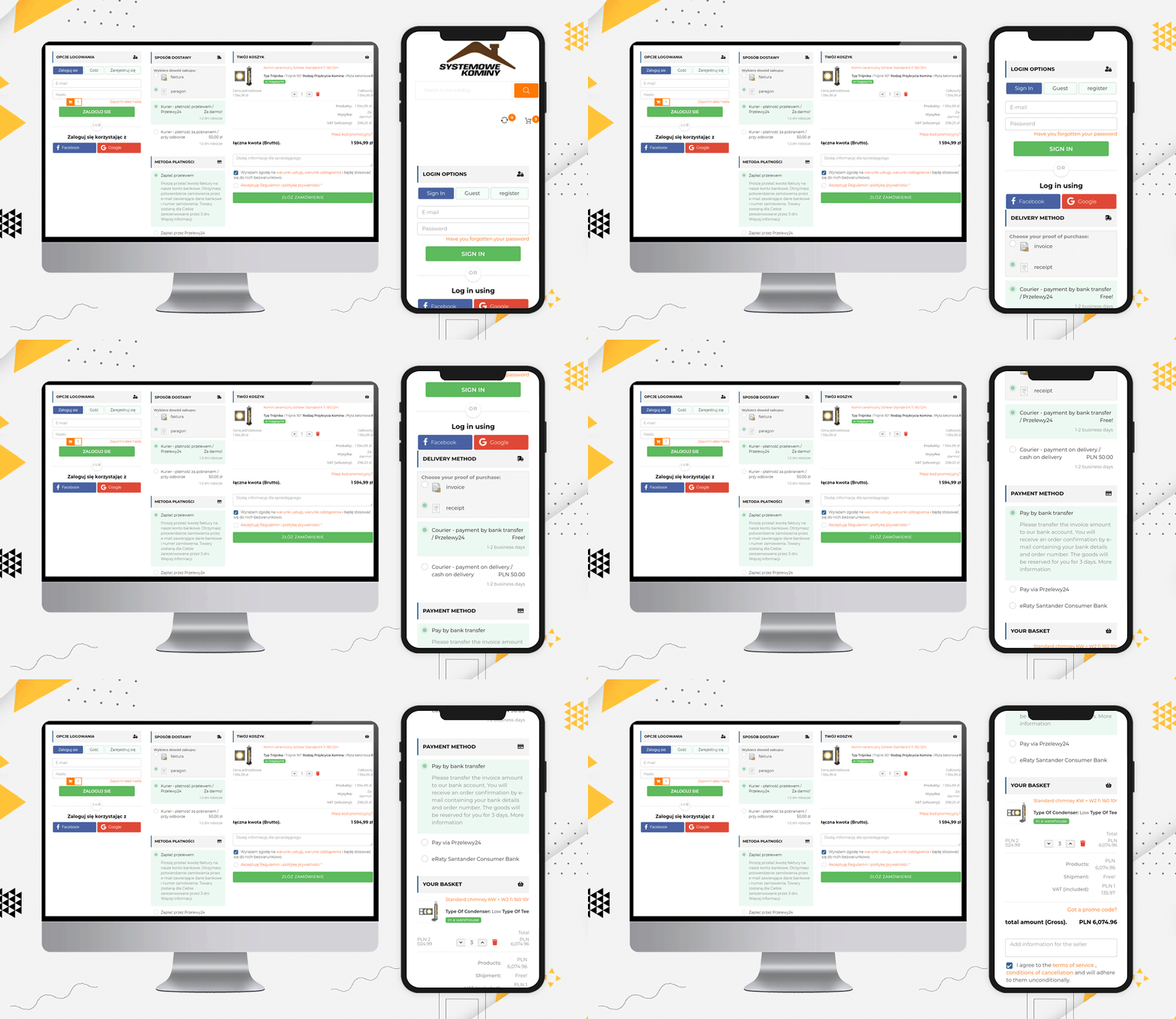
Systemowe Kominy
Since we have been talking about the layout, Systemowe Kominy also has a wonderful layout design. They are using social login, guest checkout, and all the fields are displayed in a structured manner that could fit the desktop size and the user does not have to scroll much.
Such layout encourages customers to complete the process as it appears to be quick and simple.
Dev.tuppi
Another layout design for a checkout page can be a single column view as used by Dev.tuppi store. This Poland-based store is using almost every feature on the checkout page. The layout looks sleek and more appealing.
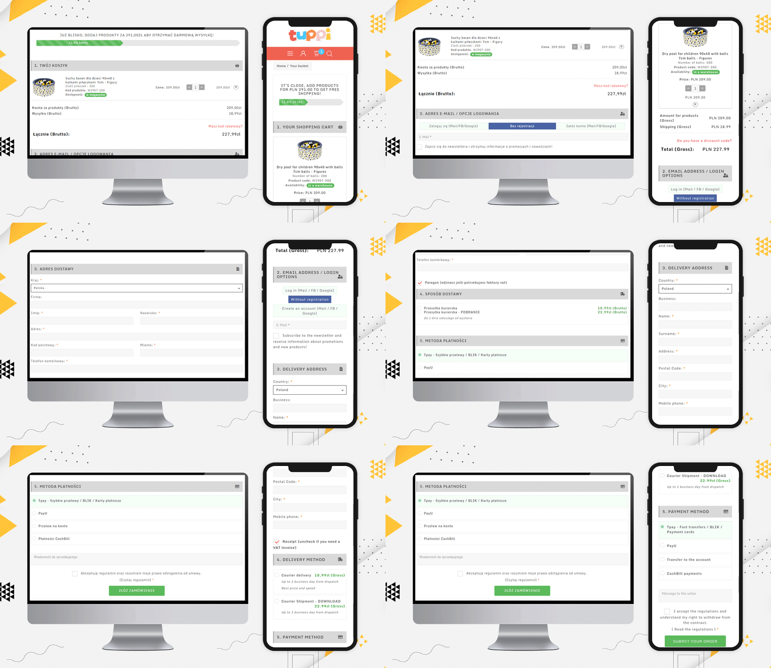
It is better to show the progress bar and Free Shipping options
Another checkout practice that every eCommerce should follow is showing the process progress. Be it a multi-page checkout or single-page checkout, the progress bar allows users to see their current position in the entire task.
Edukacyjna
Edukacyjna is also offering free shipping to customers if they fulfill the eligibility criteria. This free shipping bar increases the average cart value. Hence, it is always good to add such a feature to your checkout page.
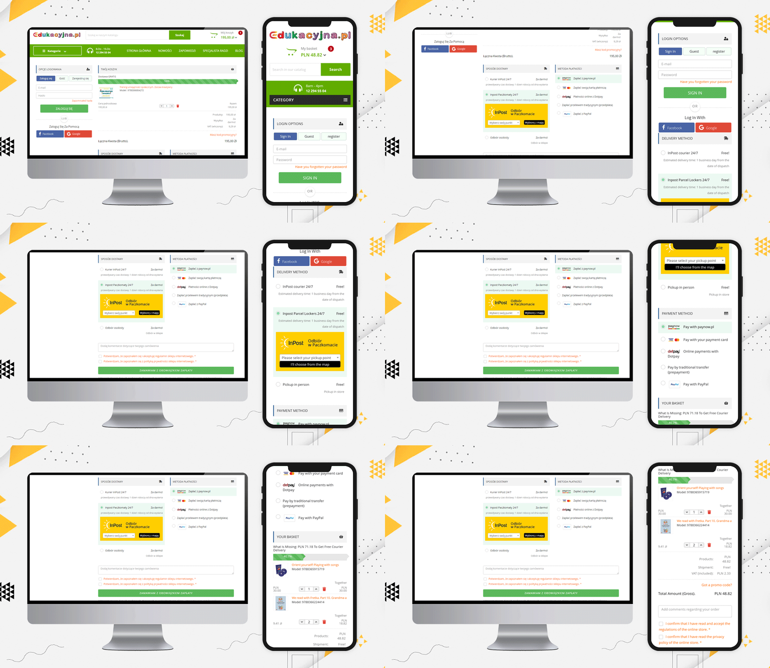
Display Products and Cart details on Checkout Page
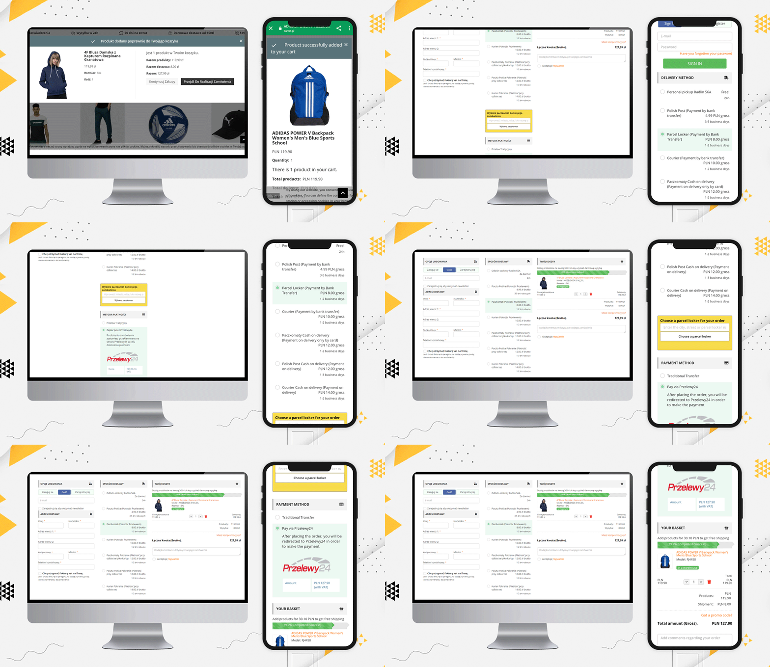
When a customer visits a retail store, they can see and observe the products they are buying. Providing this very same experience on an online store is now possible.
A shopping cart contains the entire selected product that you are going to purchase and once you are done choosing, you can place your order. Prestashop One Page Checkout displays the complete order on the final checkout page.
Darcet store
Even a user can update the product quantity if they want. The Darcet store’s checkout page has used it quite well.
Add additional fields and ask for their comments
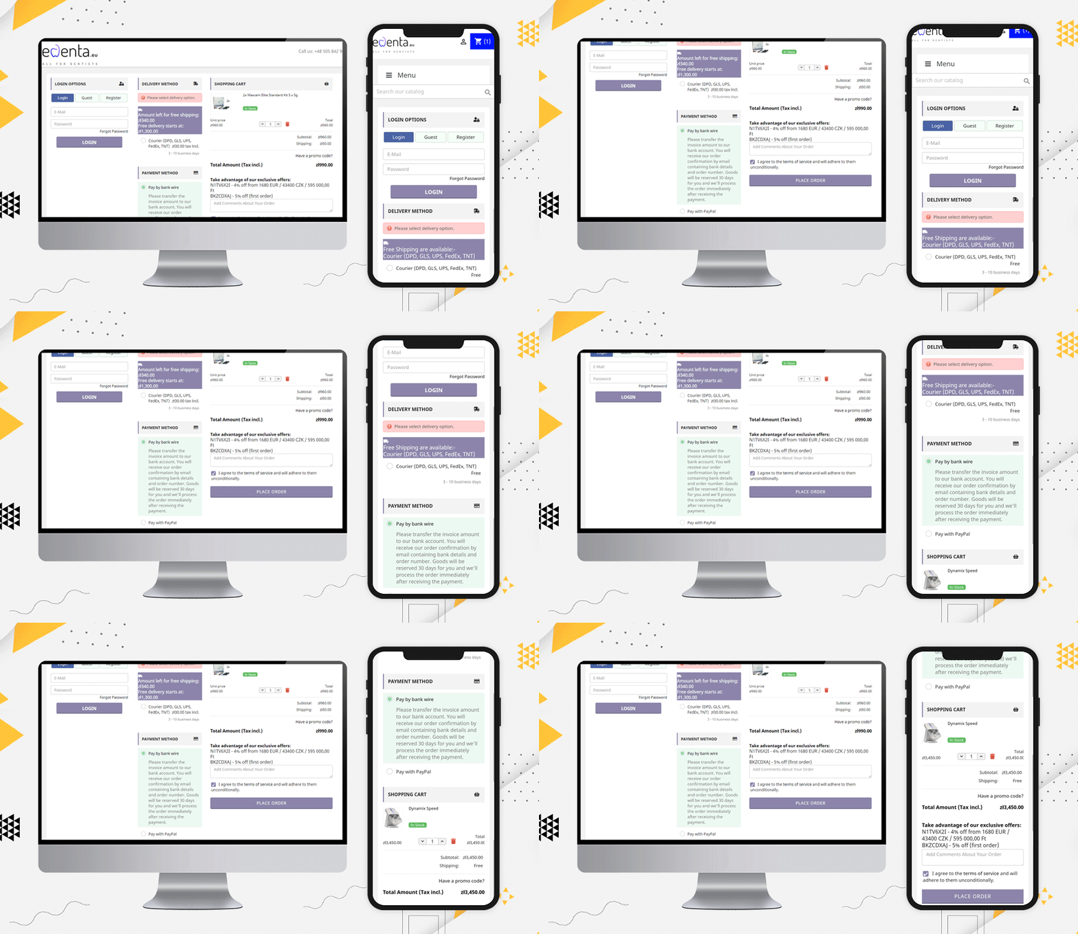
edenta
Like Edenta, checkout page should have field for their customers if they have any comments regarding the order they are placing. Also, it is an amazing checkout page practice to show the coupons and deals on the checkout page.
“Take advantage of our exclusive offers:
N1TV6X2I – 4% off from 1680 EUR / 43400 CZK / 595 000,00 Ft
BKZCDXAJ – 5% off (first order)”
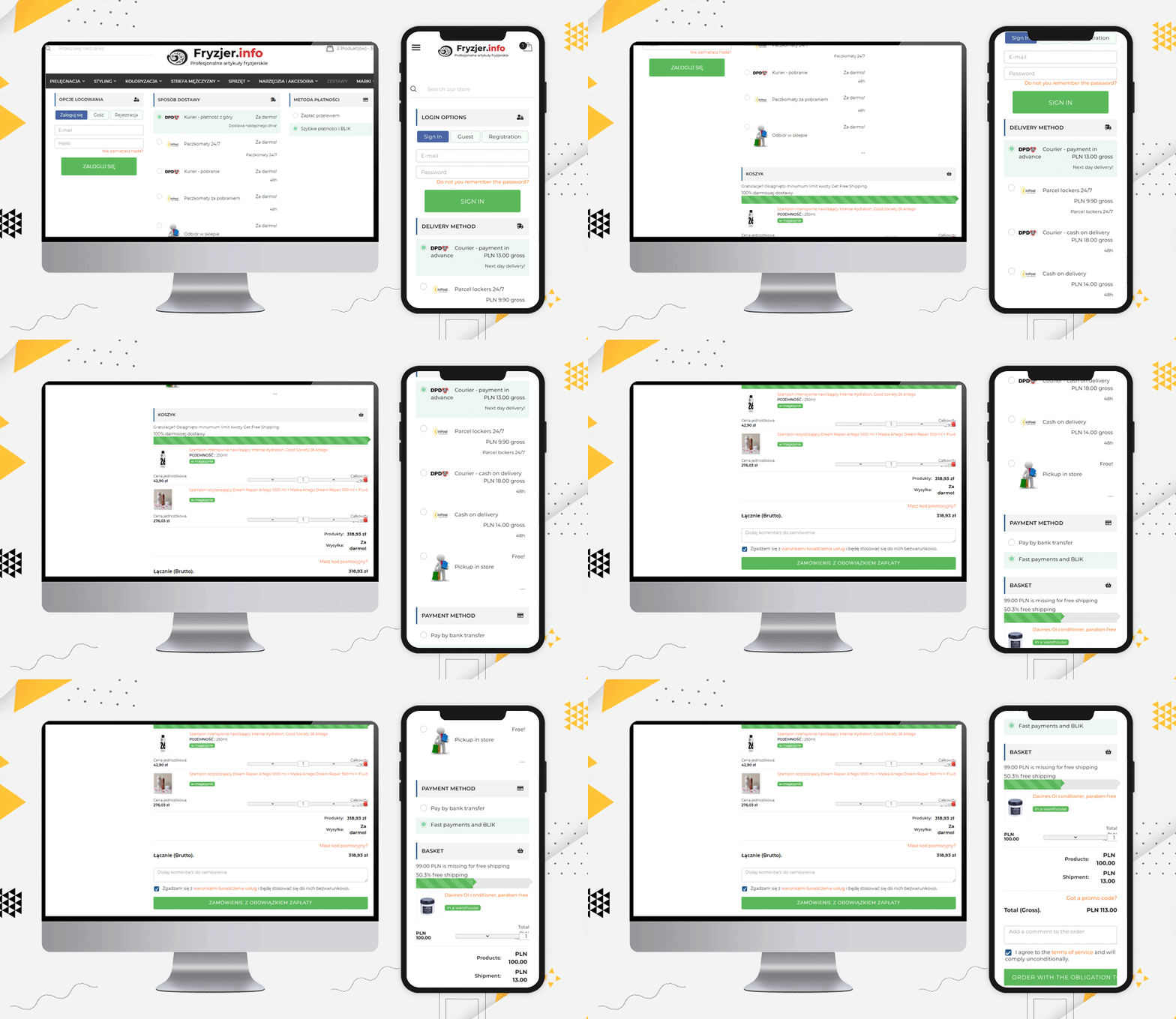
Fryzjer is a PrestaShop eCommerce store with various features on its website. Every page is very well designed and gives a satisfactory user experience.
For checkout page user experience, they have used KnowBand’s PrestaShop One Page Checkout for Poland-based eCommerce store, and look how it appears!
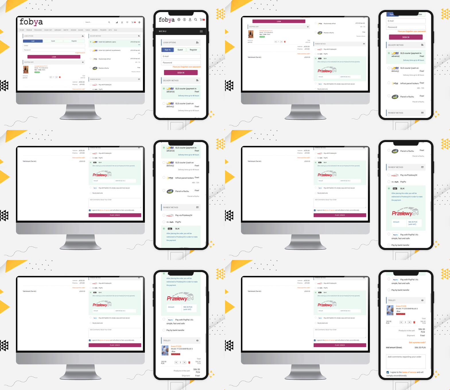
Fobya’s
Another best example of Checkout for Poland’s eCommerce store is Fobya’s website. The checkout page has several shipping options listed on it and most of the popular payment methods of Poland are listed.
Laser
Moving on, let us see this beautiful checkout page example of Laser. On this checkout page, along with all the above-mentioned features, they have displayed the icons of all the accepted payment methods on the checkout page.
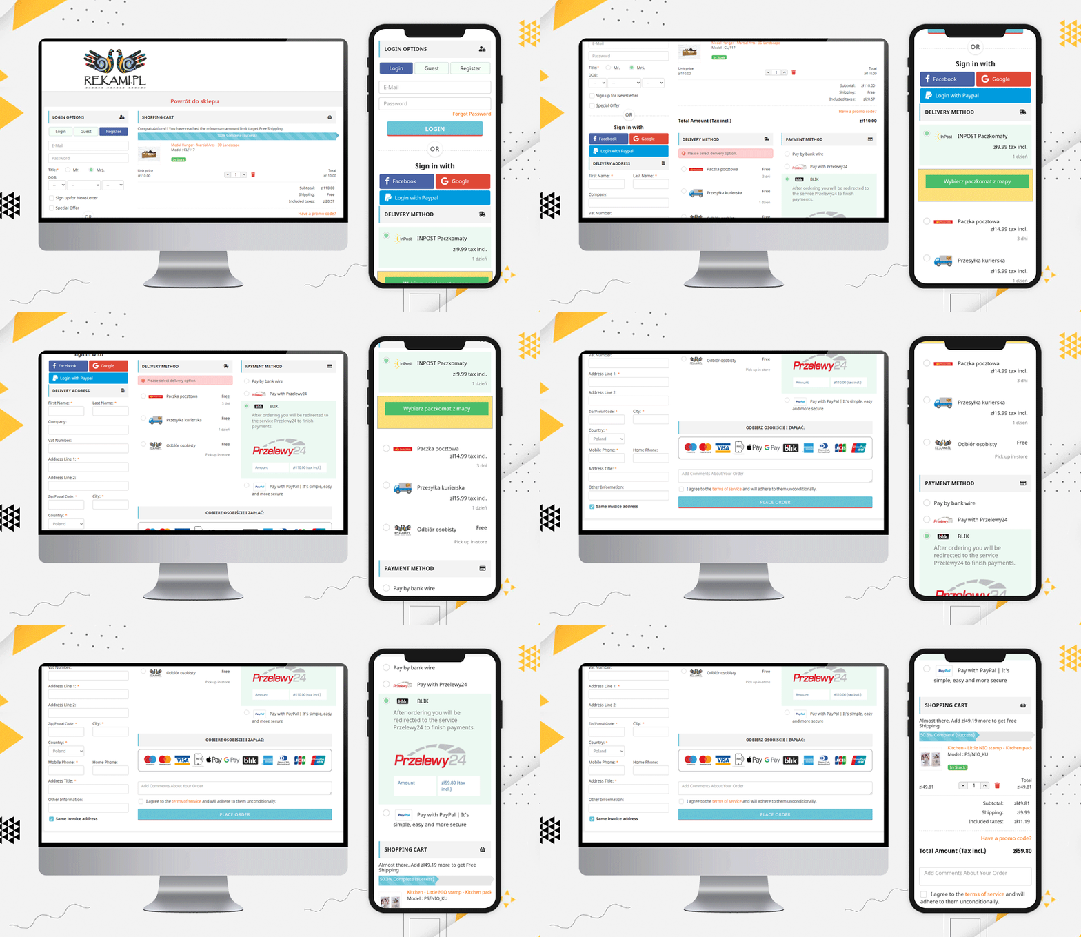
This clear view of available payment methods assures users that their transactions will be secured.
Popular Payment methods in Poland:
From the above checkout page examples, we have compiled the list of popular payment gateways of Poland.
Przelewy24, PayPo, PayPal, Pay by bank transfer, blik, Zobacz na, bank wire, Payu, Card, Tpay, Paynow, Dot Pay, COD are the most accepted payment methods of Poland.
Popular Shipping Methods used in Poland:
Here is a list of Shipping methods that are famous and most used in Poland:
Kurier DHL – prepayment, Paczkomat InPost – przedpłata, Kurier DHL – pobranie, Paczkomat InPost – pobranie, płatność kartą, Odbiór z magazynu – przedpłata, Odbiór z magazynu – płatność przy odbiorze, GLS courier, Cash on delivery – Kurier GLS, INPOST Parcel lockers 24, Inpost Courier, DPD courier, Pickup at the store (Kwiatowa 9), Polish Post (Payment by bank transfer), Parcel Locker (Payment by Bank Transfer), Courier (Payment by bank transfer, Paczkomaty Cash on delivery, Polish Post Cash on delivery (Payment on delivery), Courier Cash on delivery (Payment on delivery), Courier (DPD, GLS, UPS, FedEx, TNT)
Read: Best eCommerce Payment Gateways for Poland
Note: The PrestaShop One Page Checkout module allows the store owner to add multiple payment and shipping gateways from the backend of the module.
More about PrestaShop One Page Checkout Addon:
This addon allows you to track the abandoned cart in your store and analyze the reasons for the same. The explicit features make it different from every other popular PrestaShop checkout page module available.
You can see these stunning checkout pages developed for PrestaShop globally and they are one-of-a-kind. The PrestaShop one-page checkout addon is a best seller on Knowband and PrestaShop addon store.
Finally, The KnowBand store is a PrestaShop Gold partner agency! The PrestaShop one-page checkout has 11000+ downloads! You can check out the admin panel and front-end module demonstrations at the KnowBand shop.
You’ll find solutions for all other eCommerce services in our shop. From both the seller’s and the customer’s viewpoints, all of the modules are well-designed.
Recommended Reads:

