Shopping cart abandonment and conversion rate drops on the checkout page appear to many website owners to be a harsh reality of e-commerce life. It doesn’t have to be that way, though. In reality, giving your shopper all they need to make an educated, confident decision will help you improve conversion rates on your checkout page. Take some notes from the checkout pages listed in this article used by Spain eCommerce websites developed on the PrestaShop platform.
Some elite examples of checkout for Spain eCommerce website:
The PrestaShop One Page Checkout module designed and developed by Knowband replaces your website’s default checkout with a swift and smooth One Page Checkout that improves your customer’s checkout experience. This module helps to reduce cart abandonment on the checkout page by allowing customers to easily fill out all of the necessary information and finish their orders.
There have been multiple features that make the checkout page more engaging and influence the buyer’s decision. Some of the best checkout practices followed on the Checkout page of these Spain-based online shopping websites will give you a clear idea about the dos and don’ts of a checkout page.
Design and Layout
At first, this would determine a large part of the buyer’s decision to purchase or not buy. Best shopping cart design practices, such as adequate whitespace, a simple delineation of various steps in the order process should be structured properly.
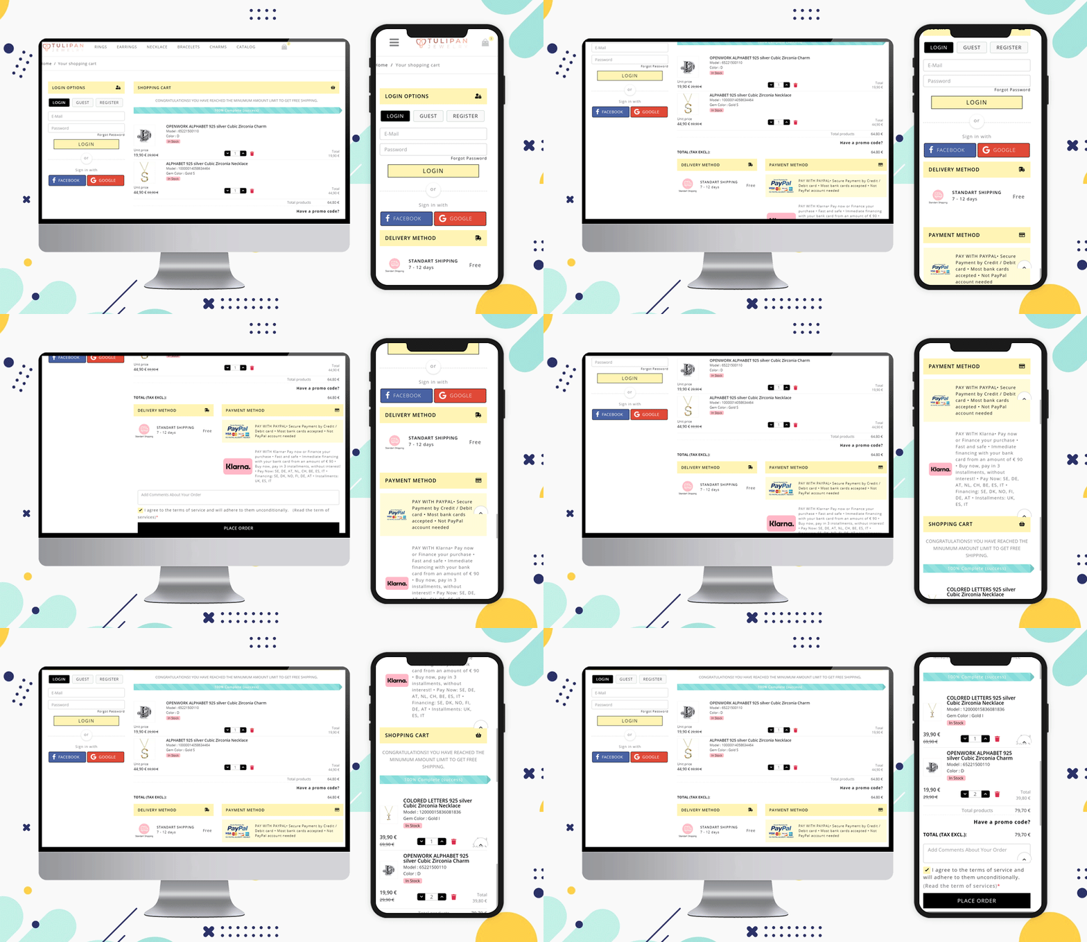
We have designed the checkout for the Spain-based website ‘Tulipan Jewelry Store’. Have a look at this clean and visually ideal checkout page.
Allow Social Login and Guest Checkout
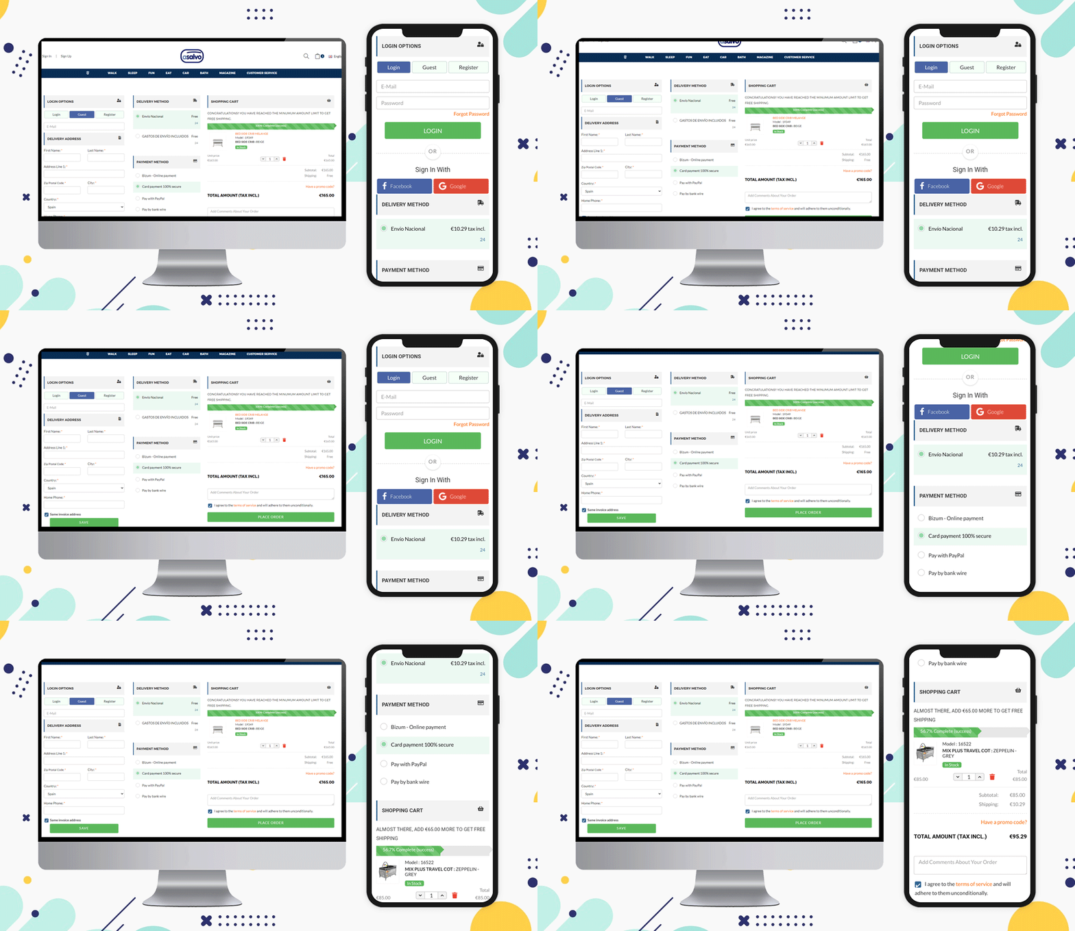
When a customer visits your website, give them choices to sign-up and log in. You can provide social login options by Facebook or Gmail account. The eCommerce website Asalvo is delivering products in Spain and it is having the social login option and Guest Checkout feature for the customers on their Checkout Page.
Inline validation and Google Auto address fill features
This is another feature that can help your customer while filling the billing address or delivery address form. Some fields can be made optional, and inline validation can be provided if a customer makes a wrong entry.
The Prestashop One Page Checkout addon by Knowband has a feature that auto-fills the address from the Google browser.
Include a product description
on the vendor’s end, having only a name and a number can suffice, but letting the customer know what size, color, and other customization options are available will help them ensure they’ve made the best decision for their needs.
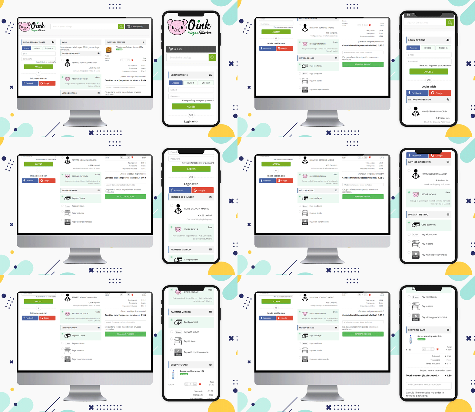
Here is an example of checkout for Spain eCommerce website Oink created on the PrestaShop platform. They have shown the product image with a description on the one-page checkout.
Oink is a store that accepts cryptocurrency and they have added this method on their PrestaShop One Page Checkout.
Update product quantity
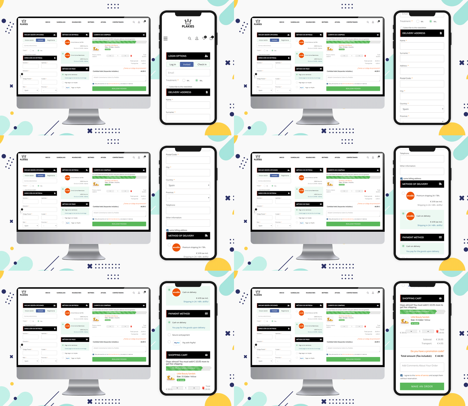
Allow the user to change the quantity or delete an item from their cart while still on the checkout page. The more times they have to hit the back button (or look for the cart icon) to get to where they want to go, the more likely they are to give up and abandon the operation.
Look at this PrestaShop eCommerce website ‘Plakies’ based in Spain and its checkout page:
Various Shipping Methods
On the checkout page, you can see a list of shipping options. Allow them to know which choices you consider before they enter their shipping address.
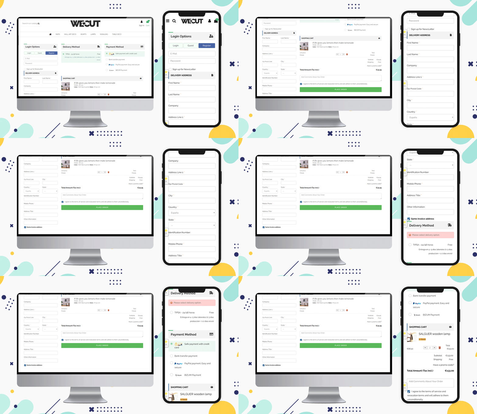
The shipping methods that are used in Spain for checkout are:
GLS Business, GLS Economy, home delivery option, pickup in-store, and various courier services working in Spain can be listed.
Before you check out, show the final price
More and more e-commerce sites are implementing this function to help avoid orders from being lost as a result of the customer’s perception of a price rise in the form of shipping/handling/tax fees.
Include credit card logos and security seals to reassure customers that your website is a safe and secure place to conduct business.
Design a Customized Layout
The layout of the checkout page should be sleek and clean. As a single-page checkout displays all the fields and information on one page, you have to keep the layout more appealing and less clumsy.
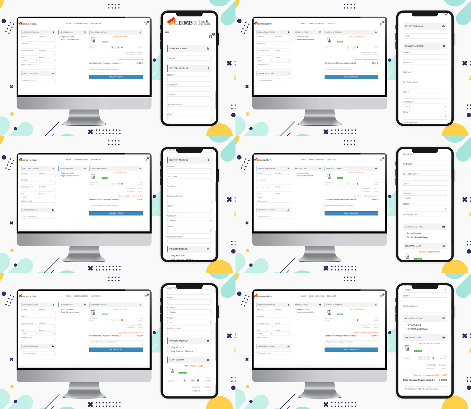
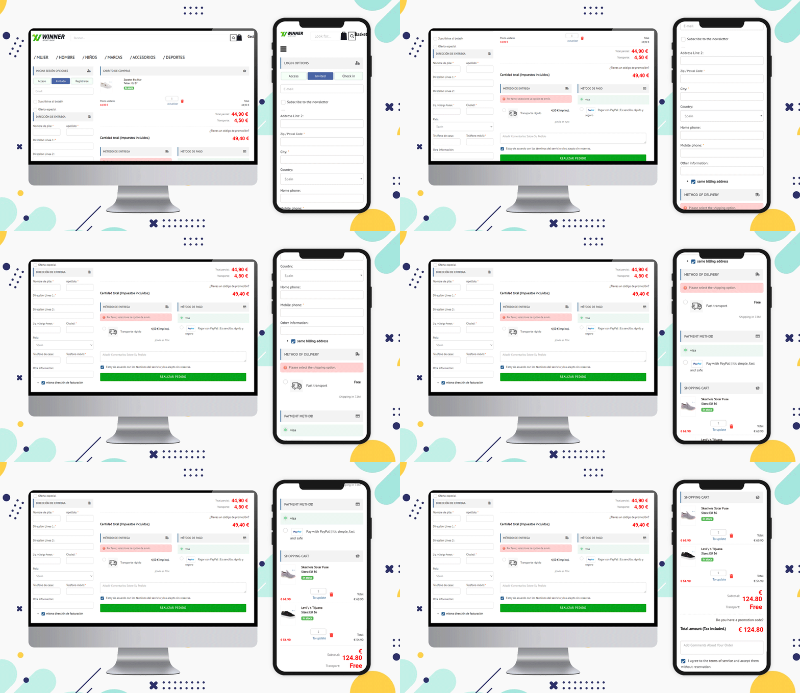
See the layouts of these checkout page designs for Spain based eCommerce:
Colecciones de Espana
Winner Sport Shop
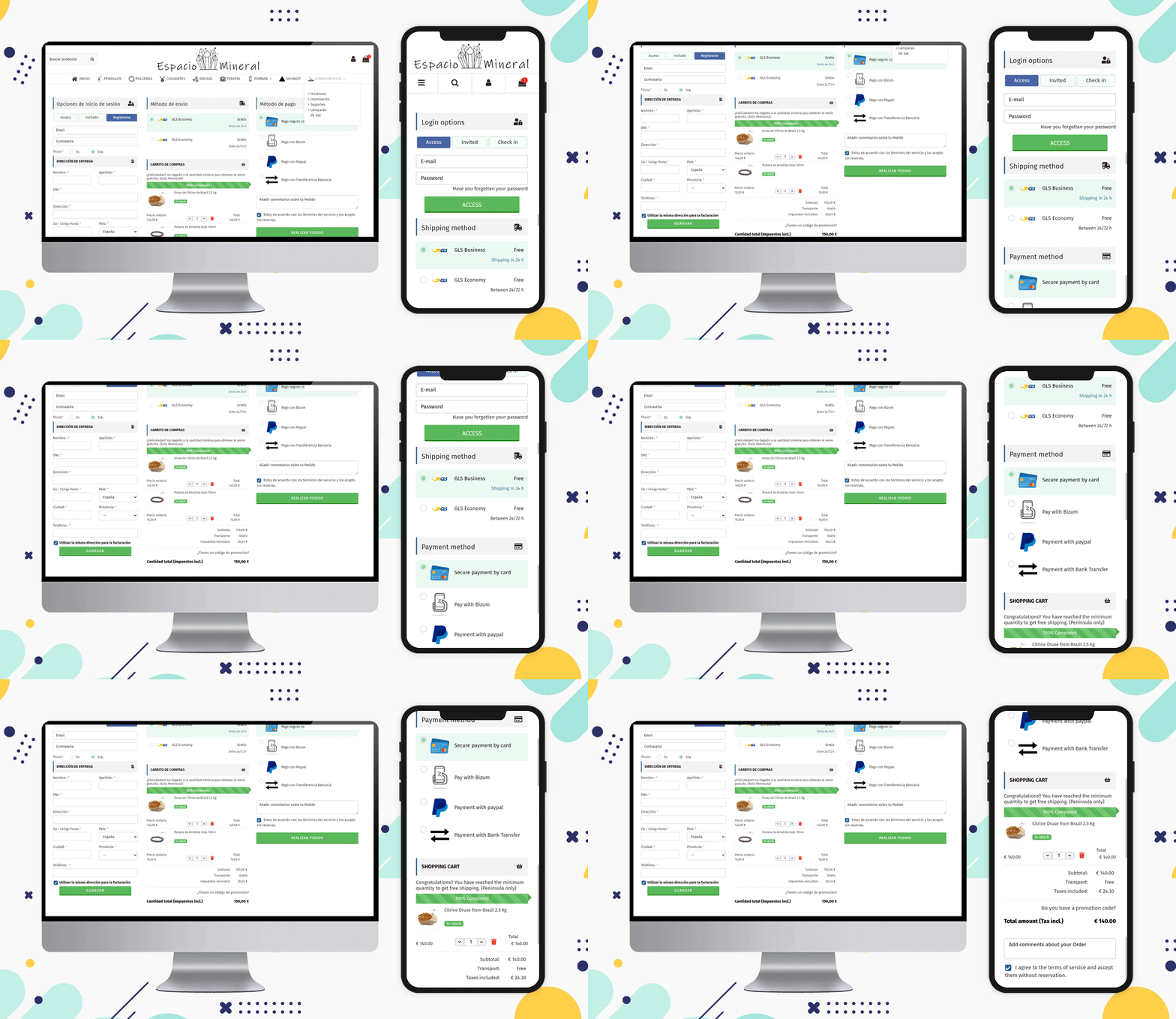
Espacio Mineral
All are using a 3-column layout but if a seller wants, then they can use single-column or 2-column layouts to make it look more structured. You can check out some of the examples of Poland-based online shopping websites and Italian websites that are using various layout patterns on their store’s billing page.
It is preferable to show the progress bar as well as the Free Shipping options
There are various types of customers and many are always looking for deals and discounts. Offering free shipping is one of the ways you can attract such buyers.
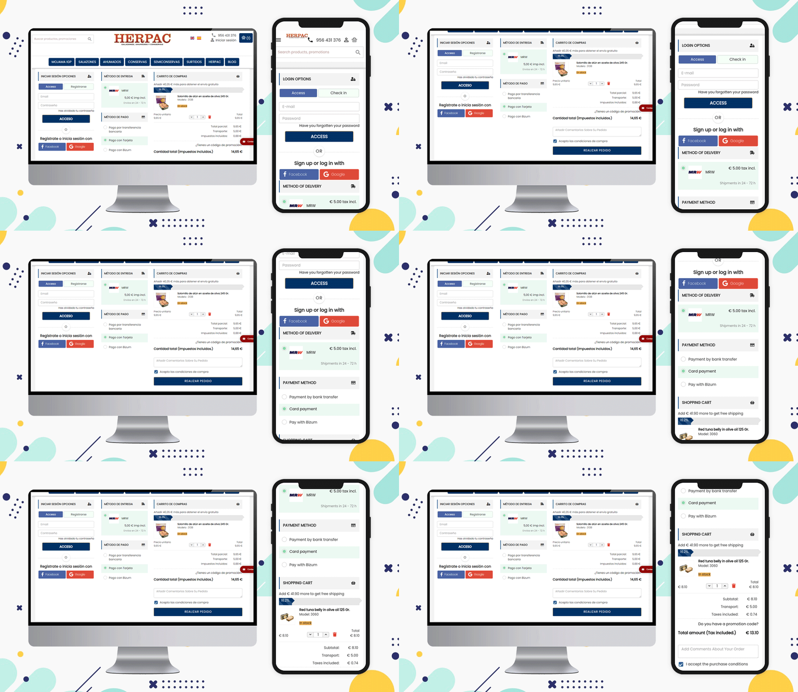
A free shipping bar at the top of the page or the bottom of the checkout page can increase the average cart value. The Herpac store has a website that delivers in Spain. They are using a Free shipping bar in their store.
Attach more fields and ask for their feedback
It is a good practice to ask your customers for their feedback and reviews and this creates a bond between the seller and the customer.
Can you ask something on the checkout page?
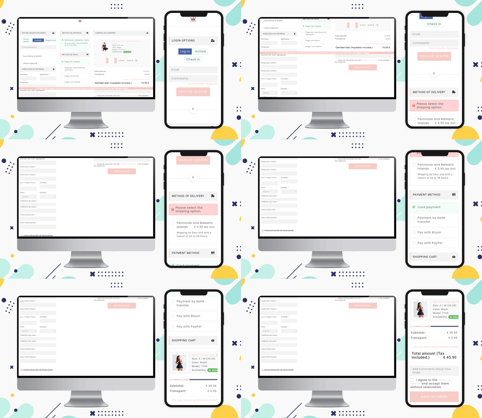
Of course, you can collect information about the order on the checkout page. If they want to add any message or comment, add an additional comment section at the bottom of the page before final checkout just like the Anaissa store.
Popular Payment Methods for Checkout in Spain:
Bizum, Paypal, Klarna., Bitcoin cryptocurrency, Card payments, Stripe are some of the most used payment methods of Spain for checkout.
Shipping Methods Popular in Spain eCommerce:
Integra 2, tipsa, GLS Business, GLS Economy, home delivery option, Pick-up in-store, and various courier services working in Spain can be listed.
Note: The PrestaShop One Page Checkout module allows the store owner to add multiple payment and shipping gateways from the backend of the module.
Why KnowBand’s PrestaShop One Page Checkout Addon?
Without a doubt, Knowband’s One Page Checkout is the superior choice. Knowband is an eCommerce module development company that PrestaShop considers to be a Superhero seller. It is also a PrestaShop Premium Gold Partner Agency.
Customers can become frustrated if they have to navigate to several pages to purchase a product. Separate pages for billing, address, order quantity, and product details. Instead, provide them with PrestaShop One Page Checkout that offers multiple features that benefit the customer as well as the seller.
Explore PrestaShop Super Checkout and you will know why this is best!
Recommended Reads:

