You need a great checkout page template to get traction for an online store. It’s not always easy to know where to begin or which features are most relevant. With so many competing recommendations for creating an eCommerce experience, identifying trends and best practices for checkout page design and implementation can be difficult.
One Page Checkout PrestaShop 1.6V and One Page Checkout PrestaShop 1.7V developed by Knowband, a PrestaShop Gold Partner Agency provide some of the exciting custom features that our Italian clients have been using in their stores.
Product Demo Available: PrestaShop One Page Supercheckout
What defines a Checkout Page?
A checkout page is a page(s) on an eCommerce store that deal with payment and shipping/billing details. Customers can enter payment information and complete their orders on the checkout tab. The customer’s shipping information, billing information, shipping method, and payment method will be collected during the checkout process, and the customer will be given the option to request the order.
Why use One Page Checkout?
There are several benefits of using one-page checkout on an eCommerce website. Your checkout should be improved regularly, to make it as fast, effective, and frictionless as possible. Customers would have a better shopping experience if you create a simple, easy-to-use, and high-performing checkout. This will reduce checkout abandonment and increase conversions.
Adopt best checkout page practices for ending cart abandonment on the checkout page. These best practices used by various Italian PrestaShop One Page Checkout users for designing, developing, and managing your checkout page will assist you in creating a user-friendly checkout that will improve sales. Additionally, we have analyzed these Italian store’s payment and shipping methods and drawn some conclusions that are discussed in this article.
10 examples of One Page Checkout PrestaShop created by our clients following best practices for best results
1. Tuttii caffe Che Vuoi
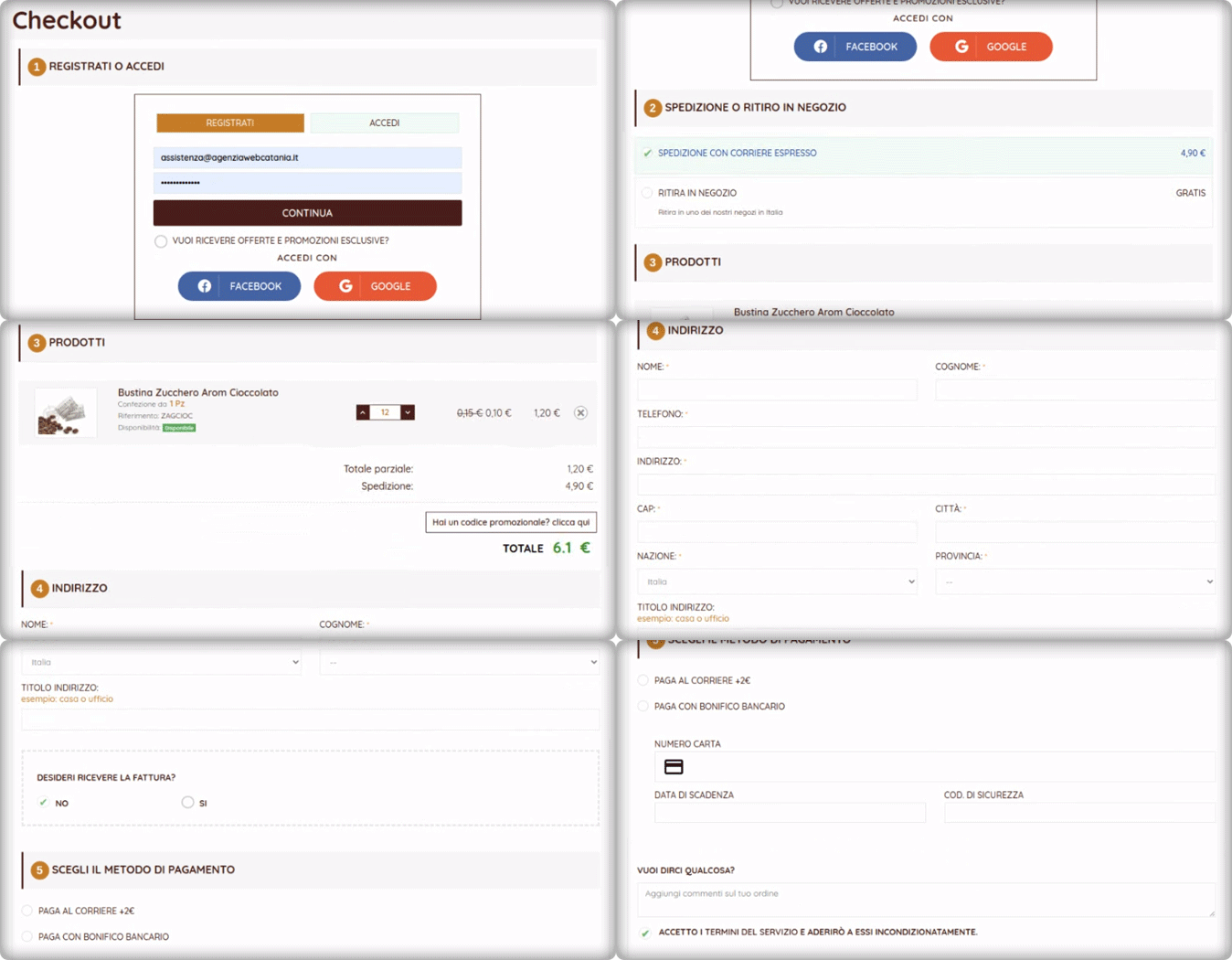
It is an Italian website that has a structured design and navigation for every page. For the checkout page, the website is using the One Page Checkout PrestaShop module with additional customized settings. Social login, single-column layout, simple and clean design of the checkout page reduce bounce rate and cart abandonment rate.
They are offering an In-store pickup facility to their customers. There are several benefits of BOPIS shipping method as it saves money and saves the seller from failed or delayed delivery.
The PrestaShop One Page Checkout by KnowBand is compatible with the PrestaShop Store locator and Pick up module and it has several exciting features that make the process smooth.
2. Preziosa Di Valentina
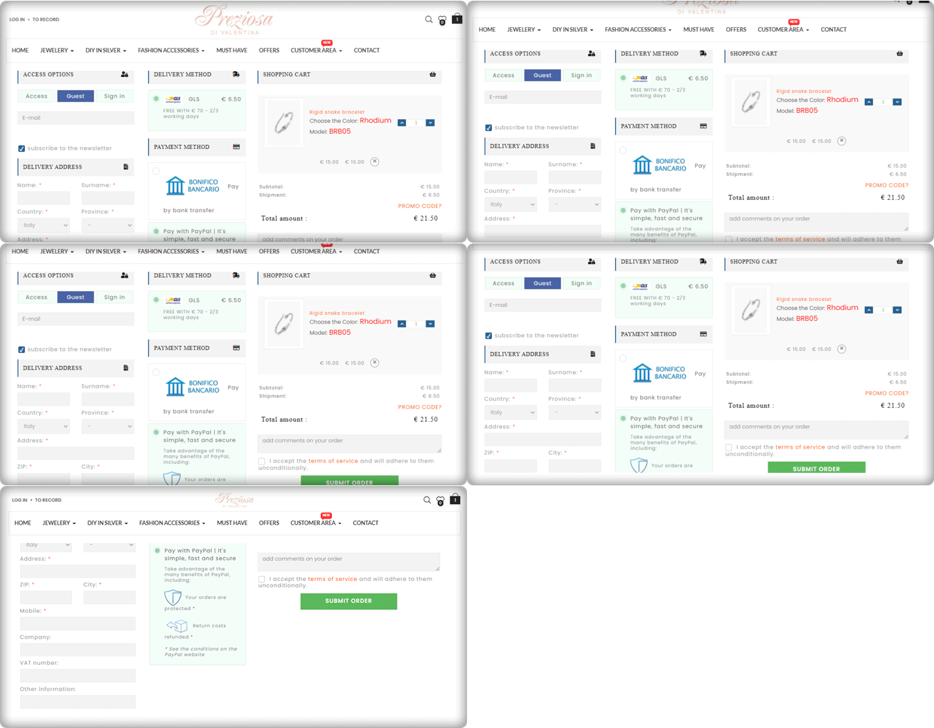
Consumers should never be forced to build an account or register before completing a transaction. Customers are inconvenienced by the additional step (or steps), which slows them down and causes them to question whether or not they want to proceed. Here comes the Guest Checkout to save you from cart abandonment. Preziosa Di Valentina checkout page has guest checkout options so that customers aren’t slowed down and can continue by simply entering their email addresses.
The delivery method used: GLS
Payment methods used: PayPal, Bank Transfer
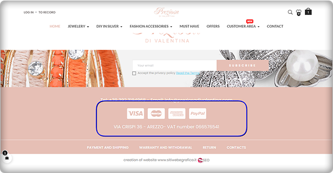
Have a look at the home page of the Preziosa. Displaying available payment methods on the home page of the website could be a great home page design idea! More than one payment gateway is an eCommerce approach that provides convenience to clients.
3. Toven
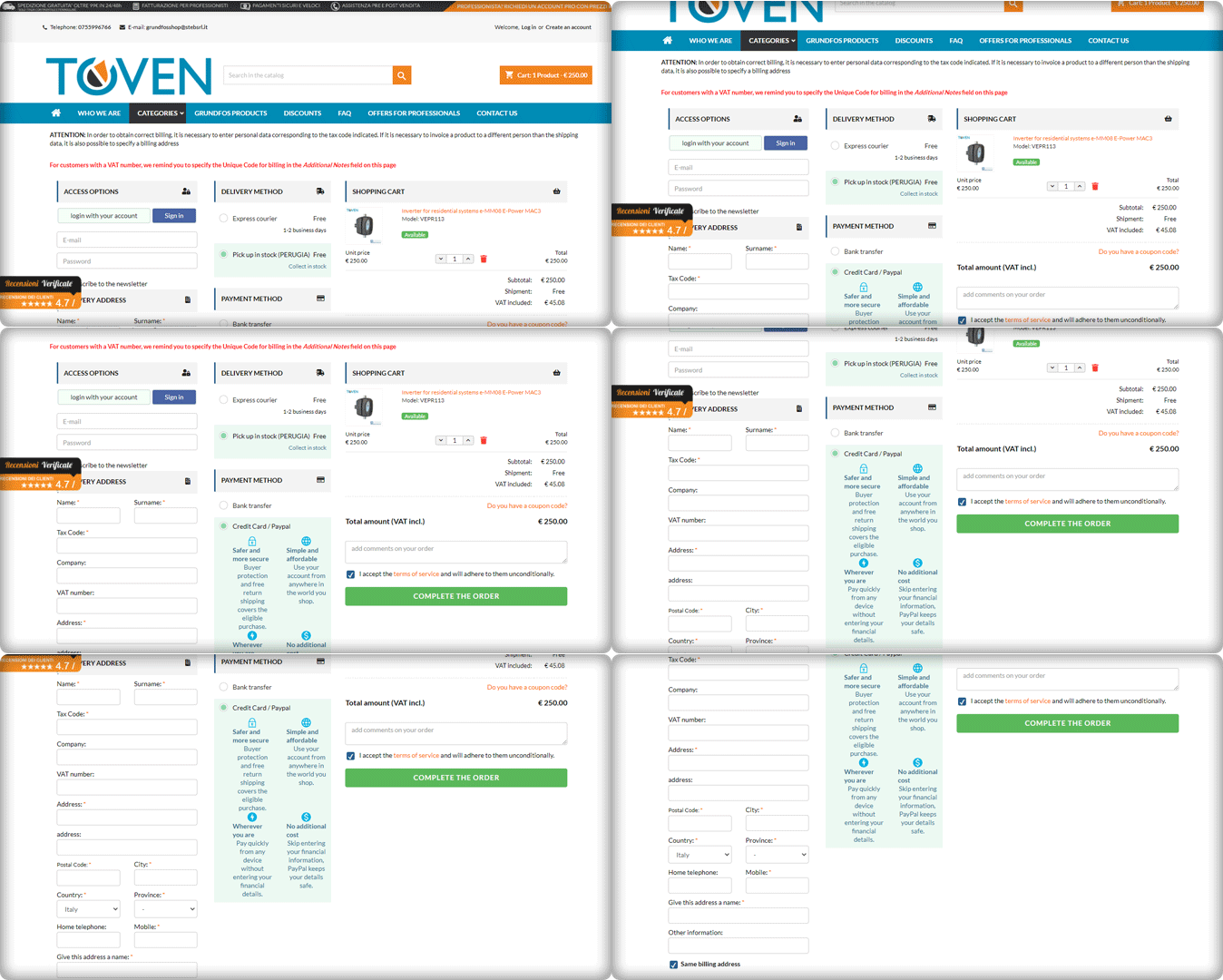
The easier you can make your customers’ checkout process, the more attractive it will be. Always keep in mind that providing an easy, straightforward, and usable process is your primary goal. Continuously improve the process by eliminating unnecessary steps, removing unnecessary form fields, and streamlining it to make it as quick and productive as possible.
Have a look at the Website’s PrestaShop One Page Checkout and its clear CTA. It has a 3-column layout that provides customers with a streamlined user experience.
4. Kraken
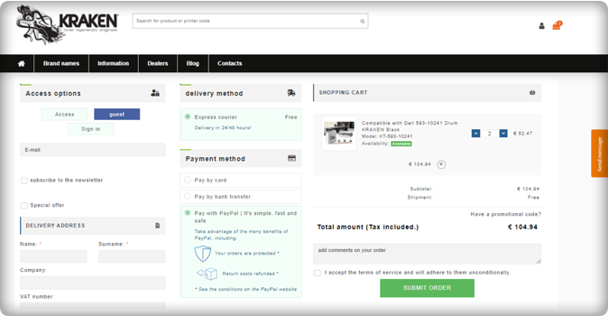
The Italian store Kraken sells premium quality toners. Kraken needed software that enables users to get an exclusive checkout experience and they chose the One Page Checkout PrestaShop plugin to achieve their goal.
The checkout page has a 3-column view that allows Guest Checkout. They have listed express courier delivery options for shipping and payment methods like PayPal, Bank transfer, and credit and debit card options.
Unlike other software where order details are not present on the checkout page, Kraken used half of the page to display the cart information, which is quite appealing gives the user a satisfactory experience.
5. Zoo Mega Shop
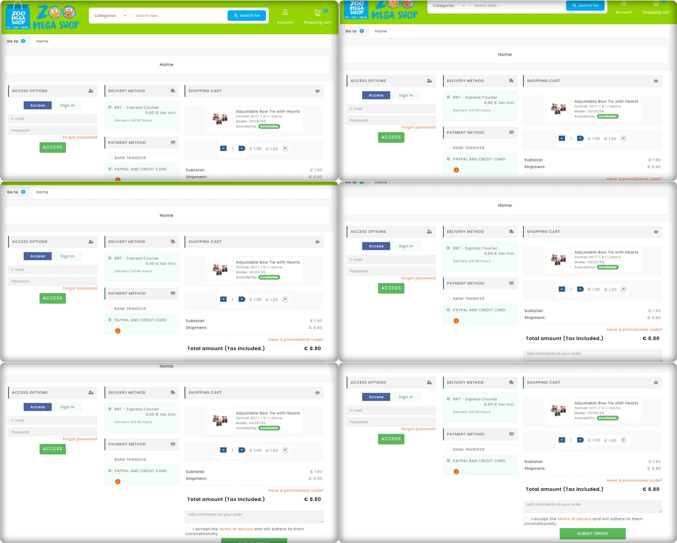
Look at this Checkout page customized by Zoo Mega Store! They used the same module (One Page Checkout PrseatShop 1.6v) with a super clean layout.
Customers can update the product quantity from their checkout page without switching any tab. Isn’t this handy!
6. Riko café
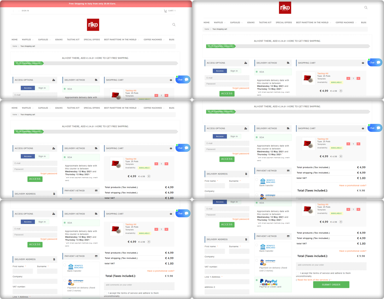
A progress indicator shows you where you are in the checkout phase while still outlining all of the steps. This allows consumers to see where they are in the process, how many steps are left, and how long the process will take in general.
Riko Café is using the progress bar feature of the One Page Checkout PrestaShop module. To provide a much richer user experience, progress bars show users how close they are to completing a collection of… details or performing activities.
They have shown the delivery method along with the details of the expected delivery date. Popular payment methods used in Italy like PayPal, Bank transfer are listed in the Payment section. They are allowing Cash on delivery as well.
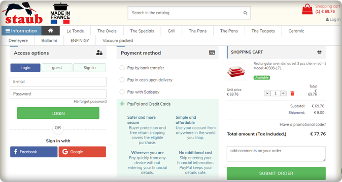
7. Staub: Made in France
We have a number of things to remember in our everyday life and adding another password to this is something we are least interested in. Save your customers from this misery with the Social login option.
Social login promotes easy and quick registration with an increased number of signups. Staub store is using Social login on their PrestaShop checkout page and providing comfort to their customers.
The collected email addresses and social media information of the customers can be further used in target marketing.
Italy’s popular payment methods listed in the Staub store are Bank transfer, PayPal, Credit card options, Pay with Satispay, and COD.
8. Farmacia Savorani
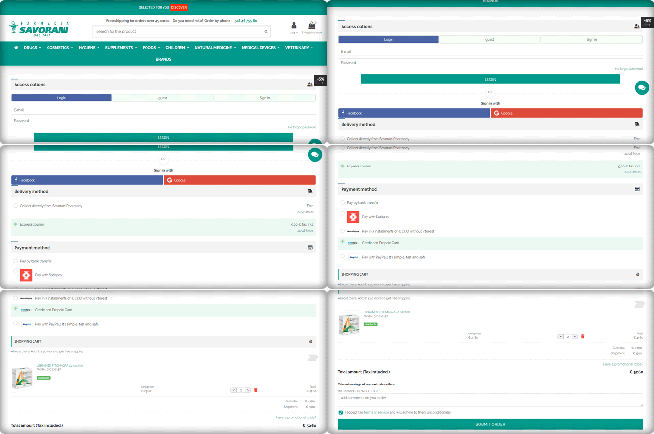
Farmacia Savorani’s checkout page has a simple, clean design that is easy to use. Their checkout follows several best practices. With many templates to choose from, the One Page Checkout PrestaShop layout can easily be customized for the use you need.
This checkout page design has a single-column checkout page. Every part of the process looks structured and clean. They have guest checkout, social login option with Facebook and Google+, several payments and delivery methods used widely in Italy.
The cart products can be seen and updated with ease. Also, customers can add a custom message to the order.
They are providing buy online and pick up in-store options to their customers. This is something that can work magic if you are using the right plugin like KnowBand’s PrestaShop store locater and pickup. Another shipping method is Express courier.
The One Page checkout PrestaShop module by Knowband is compatible with Store locater and pickup addon.
Payment gateways used by Farmacia Savorani are PayPal, Satispay, bank transfer, credit and debit card options, and EMI options.
9. Nextrace Italia
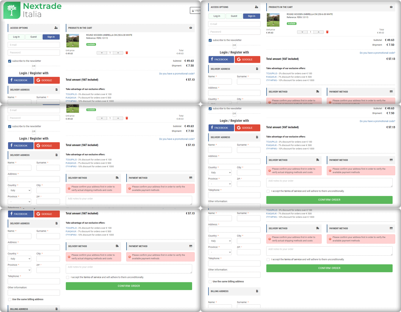
The One Page Checkout PrseatShop module allows the seller to display the delivery methods and payment methods only after they provide their address details. The seller can show specific payment methods for specified shipping methods.
Nextrace Italia is using this feature on their PrestaShop website’s checkout page.
10. Un mondo di mobile
Un Mondo Di Mobile’s website’s checkout page is another best example of a clean and sleek checkout design. This is again created using the One Page Checkout PrestaShop plugin. All the necessary features are used on this page and are fully customized.
With PrestaShop One Page Checkout addon, users can add security badges in the payment section as it builds customer trust.
Conclusions are drawn from the above data for famous Payment gateways and Shipping methods in Italy
We can deduce from the above-mentioned Italian store checkout page details that there are a few commonly used and suitable payment methods.
- Every store has a PayPal option listed as their payment gateway.
- Along with that, they are accepting payments through Satispay, credit card, debit card, bank transfer, and scalepay.
- Some of the stores accepting installments for the orders with ScalePay.
- One Page Checkout PrestaShop plugin is compatible with PayPal, Satispay, and other common payment gateways like the card and bank transfer.
- For shipping or delivery methods, Italian stores are using GLS Express courier Italy, BRT express delivery Italy, SDA Express Courier Italy, etc.
- Out of 10 stores, three are offering an In-store pick-up option. Looks like it is gaining popularity!
- One Page Checkout PrseatShop module is compatible with all the famous shipping methods like GLS Express courier, BRT express delivery, SDA Express Courier, etc.
Final thought:
You shouldn’t have to choose between offering high-quality security and fraud prevention and optimizing for the best customer experience. KnowBand’s PrestaShop One Page Checkout 1.6v and 1.7v module is designed with best practices in mind, providing customers with a frictionless user experience, lightning-fast processing, and unrivaled security.
The module facilitates multi-lingual compatibility that allows you to use it in any region of the world. It is compatible with all the other PrestaShop modules like Social Loginizer, Store Locator, etc. developed by KnowBand. The One Page checkout extension is also available for major eCommerce platforms like Magento, Magento 2, OpenCart, etc.
For any eCommerce development services or module, requirements visit Knowband store or drop an email at support@knowband.com to discuss.

