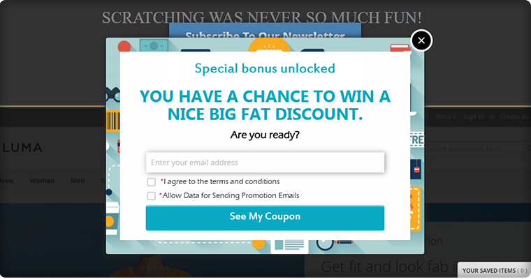
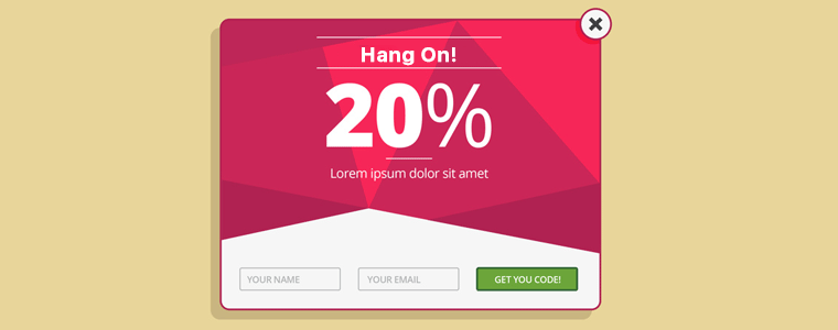
As an online store visitor, most of us will relate to the fact that an exit popup, while you are browsing a site, are annoying. From a prospect of an eCommerce store owner, the good news is that it actually works. The classic discussion of whether to have this functionality on your site or not is still on.
The statistics have given a green signal to exit pop-ups. Especially, the gamified exit popups have shown double the conversions as compared to the traditional ones. Listed below are some of the reasons that show the worth of having such triggers when the visitor plans to exits.
How Pop-up Optimization can Curtail your Exit Rate?
Customer engagement is the key to enhance the chances of conversion. Hence, the exit popup triggers can hold the visitor back and can enable you to retarget your products. Using exit popup marketing tactics while the users are still browsing the site may be fatal. Hence, using an exit popup at the end is a no-lose trick.
The discounts and other such offers may help the visitors in making the purchase decision.
The exit popup serves the purpose without breaking the natural flow of the customers. The usual behavior of online visitors includes the process of web search. Once they end up on the landing page, they browse the products and leave the site if they are not satisfied with the price or the product.
Thus, offering a discount just as they are about exit may help them reconsider.
Moreover, the exit popup gives enough time to the visitors to browse the site and grab the information being offered. However, trying anything of this sort, in the beginning, may distract them.
Having discussed the various benefits that make use of exit popup inevitable, it is now time to lay some light on how to make full use of it. The blog has compiled some of the hacks that can help you optimize the exit popup for your site. Scan the points mentioned below and get the desired result.
Apply these pro tips for exit pop-up
1. Get rid of the monotony
Even though the whole idea of exit popups is to keep the visitors from leaving the site, it can still ruin the entire user experience if not targeted appropriately. The tedious and boring exit popups asking for the visitors to enter their email ids may even reduce the chances of them revisiting your site.
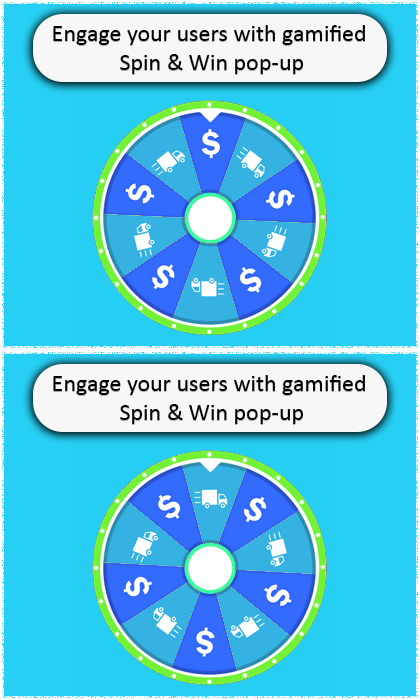
Hence, the very first exit popup hack is to make them interesting. Prestashop spin and win module are one of the examples of a fun-filled exit popup. Instead of flashing the annoying messages on the screen, the exit popup module provides a playful interface to visitors. This exit popup is made to spin a wheel by entering their email ids.
Additionally, the pop-up displays multiple themes for holidays, events, and festivals such as Halloween, valentines day, Diwali, New Year, etc. The Spin and Win pop-up also display the number of offers grabbed by visitors.
The prizes won can be used while shopping. The use of exit popup is not just an effective way to improve customer engagement but can help to enhance the UX without annoying them. Hence, making it enjoyable is one of the ways to exit popups effective.
2. Make it appear as if the customers have hit a bargain
The messages in the exit popup need to be in line with the visitors’ activity. The visitors of eCommerce usually look for offers and discounts. Their online searches are in general aimed at comparing the prices of the product.
However, the free coupons sometimes fail to entice the visitors. Its human psychology that if a discount of 10% is offered to them by a person distributing pamphlets, it may not intrigue them. While they will be happy if they bargain the same amount or win the discount through a context.
The Spin and Win exit popup is one of the ways to cater to this human psychology. To wrap things up, use innovative ways to give away the prizes and even a small offer will be well appreciated.
NOTE: You can use spin and win as entry pop-up, exit-popup as well as email subscription pop up
3. Keep it mobile responsive
A significant share of the eCommerce traffic comes from mobile phones. Hence, making your website mobile responsive is not enough. Even these exit popups should be responsive enough to effectively curb this traffic into leads. Considering this aspect, no matter what type of exit popup you use, it should be mobile responsive. View your exit popup on the screen of the mobile as well as other handheld devices. The content and the CTA buttons should be placed optimally. Some of the exit popups may even ask visitors to download your mobile applications when they try to leave the site.
4. Give visitors an option to say no
Ironically, the exit popups that allow the customers to say “no” are the ones that are less annoying for the visitors. The exit popups that cover the entire screen and provide no option to remove them are considered most annoying. Moreover, instead of the ‘X’ button, the use of ‘Yes’ and ‘No’ buttons are considered more effective. It has a psychological impact and compels the visitors to read the text. The aggressive text such as “No thanks, I don’t want to boost my sales” and other such contents at times make the user think twice. However, it may not be fruitful every time.
More PrestaShop Modules to use as Exit Popup
1. PrestaShop Exit Pop-up Addon
Use an exit popup addon on the PrestaShop store to increase the conversion on your store. The Exit Popup developed by Knowband displays a pop-up window on the visitor’s screen as soon as they intend to leave the website. It can also be used as an entry popup.
2. Scratch Card as Exit Popup
Another way you can stop your visitors from leaving your website is by offering a scratch coupon. The scratch card for PrestaShop allows you to customize it for various activities.
3. Abandoned Cart reminder Popup
You can also consider using an abandoned cart reminder pop for the customers who left products in their cart. The abandoned cart addon does not just allow you to send a popup but also reminder emails and push notifications. many features are included in this powerful converting tool. Read this pro tips article to learn how to design and send serial reminders for reducing abandoned carts.
Conclusion
Before wrapping up the entire write-up, here are some of the key points that you need to consider before design an entry or even exit popup for your website.
- User experience is the key.
- The content of the enter or exit popup should be self-explanatory.
- Give people a choice to exit as well.
- Use an attractive and engaging design in the enter or exit popup.
- Make the entire scenario fun for the visitors.
- Don’t just give away the offer. Ensure that your customers feel as if they have won the deal.
- Do not promise anything that you can’t keep. You need to build the trust factor with your customers.
A number of eCommerce businesses have used this strategy to reduce their exit rates and raise conversions. However, it now the time to take the marketing tactics to the next level by ditching the traditional methodologies and considering the human psychology. Work on the things that your target audience is looking for and avoid introducing the things that annoy them. Optimize your site with an exit popup like the Spin & Win module and boost your conversions effortlessly.
You Might Also Like:


