One Page Checkout displays all the elements of a conventional checkout, including cart items, billing and shipping addresses, shipping methods, and payment details on a single page. One-page checkouts were first implemented in an attempt to streamline the checkout process by which the number of clicks and pages needed. To give a brisk, we have compiled a few remarkable PrestaShop One Page Checkout examples that are blazing.
For the PrestaShop platform, KnowBand’s One Page Checkout is one such popular module that has 15000+ downloads on the KnowBand store and PrestaShop Addon store. The module is a one-stop solution as it supports multiple payment gateways, shipping options, provided social login option, and has a feature like MailChimp email synchronization.
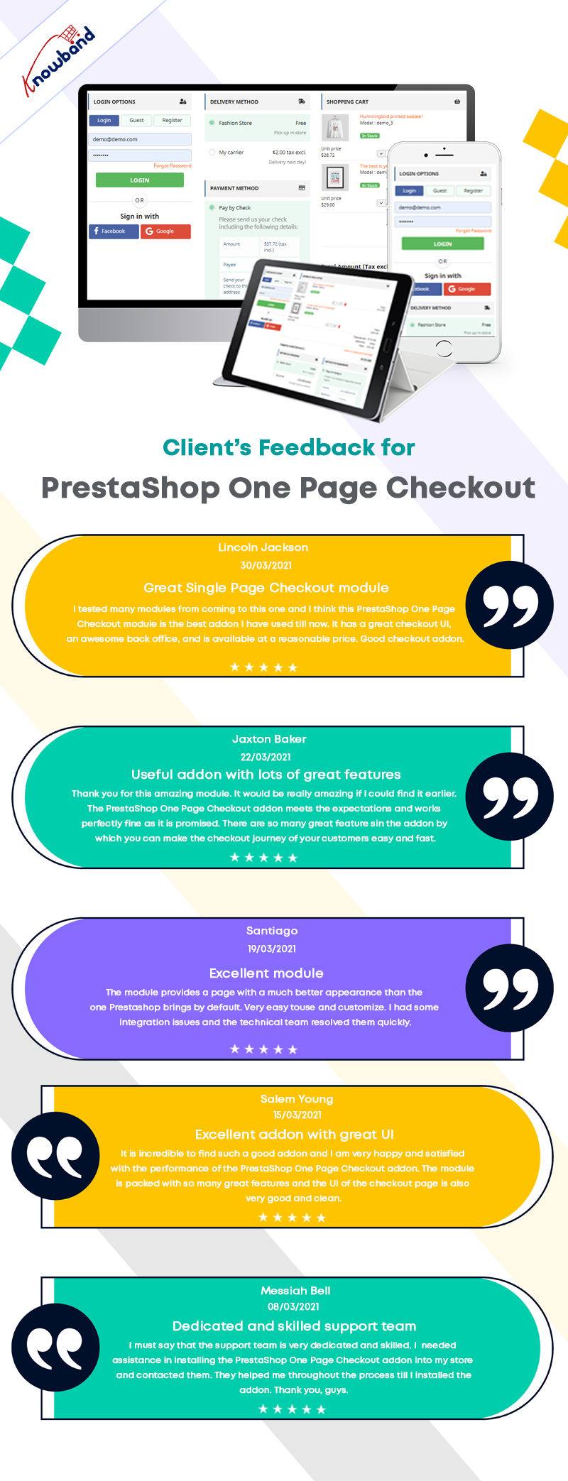
In this blog post, we will show you 7 beautiful examples of PrestaShop One Page Checkout Module that are live and working effectively on various eCommerce stores worldwide. Before jumping to it, let us see what clients have to say about the One Page Checkout and their experience with Knowband.
Prestashop One Page Checkout live examples
1. LUO Online
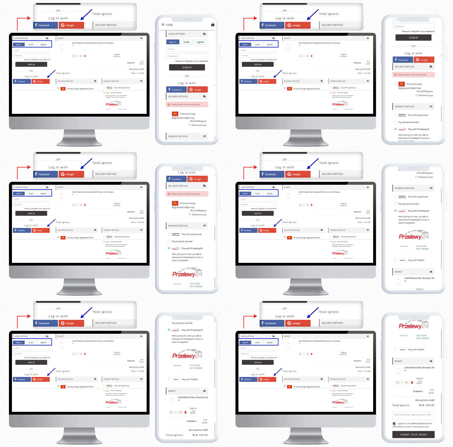
LUO online is a Fashionable Jewelry store created on the PrestaShop platform that delivers products in Poland. To make the checkout experience smooth and quick, LUO is using the One Page Checkout module by KnowBand.
The Mobile responsive checkout page displays all the fields on a single page including the registration column, Social login option, shipping, and payment methods, and the products of the cart. It also supports guest checkout functionality for users who do not want to register.
If a customer has any promo code then they can add that during the checkout process.
Payment Methods listed for Poland Customers: Pay with Paynow, Pay by bank transfer, Pay with Przelewy24, Pay with PayPal
2. LUX DOM Furniture
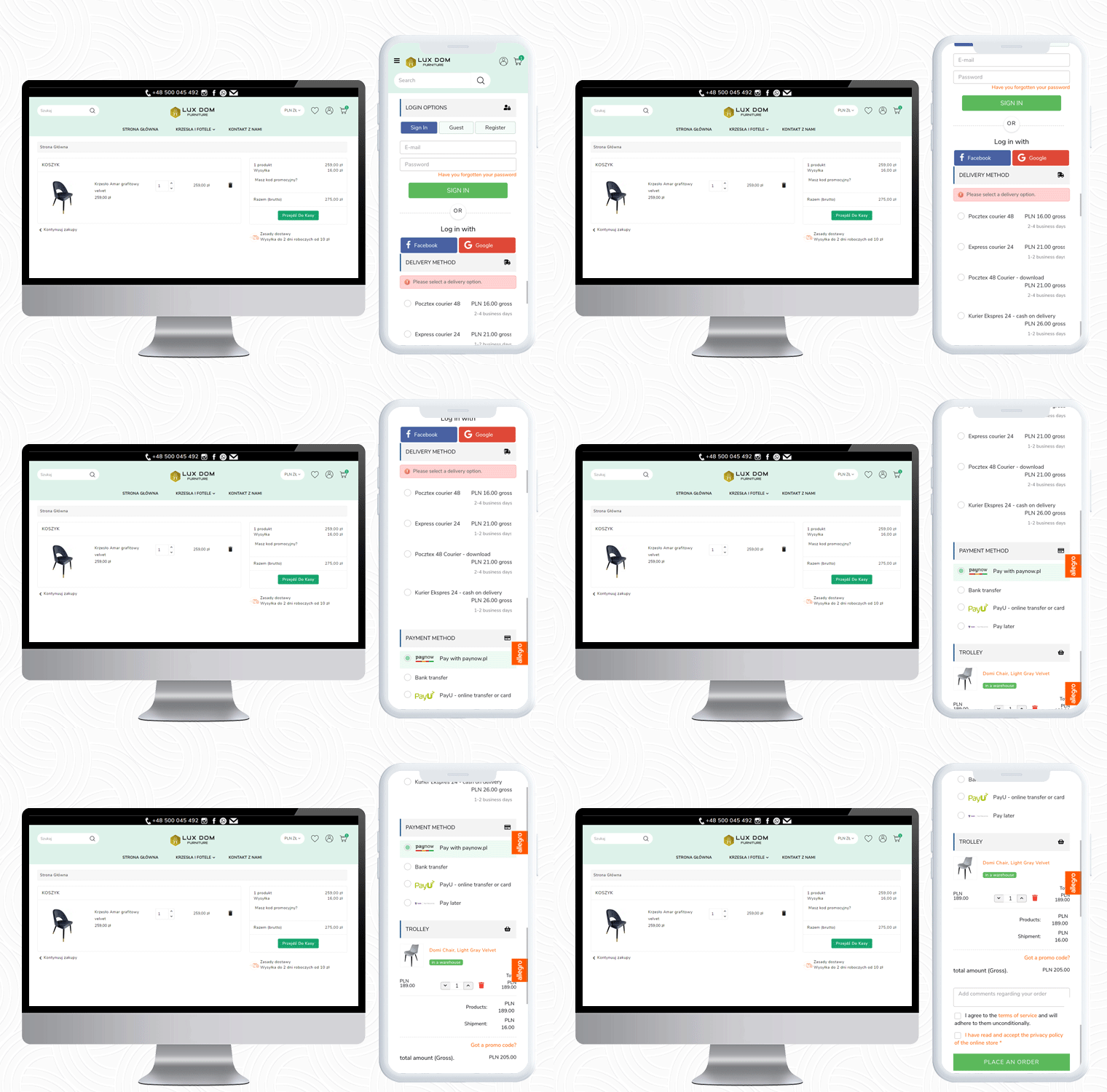
LUX DOM Furniture is a Poland-based furniture website with a customizable three-column checkout page. Users can log in via Social media platforms like Facebook and Google+.
The free delivery eligibility bar is displayed at the bottom of the checkout page. Every order with an amount above 150PLN will be eligible for free delivery.
In the LUX DOM furniture store, there are specific payment methods for specific shipping methods selected.
Payment Methods listed by LUX DOM: Paynow, PayU, Przelew bankowy, Zapłać później
3. Edukacyjna
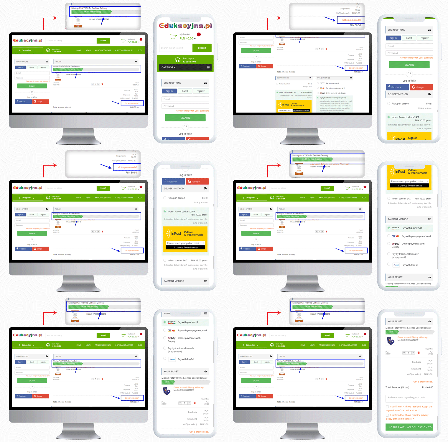
The third live example of the PrestaShop One Page Checkout addon can be observed on Edukacyjna, which is an educational online bookstore. The first educational bookstore in Poland, offering methodology guides for all Polish publishing houses’ textbooks.
The PrestaShop One Page Checkout has several features and Edukacyjna is utilizing those in a proficient manner.
In the picture below, along with the features mentioned earlier, a ‘Progress Bar’ is displayed for the checkout process.
This educational website is providing several payment methods to their customers, and for every shipping method, they have listed different payment methods.
Payment Methods Listed for various shipping methods: Pay with Paynow.pl, Payment via VISA and Master Card, Online payments with Dotpay, Pay in cash on delivery, Pay by traditional transfer (prepayment), Pay by bank transfer with deferred payment (14 days) – only for educational institutions, Pay with PayPal
4. Cyrenzo
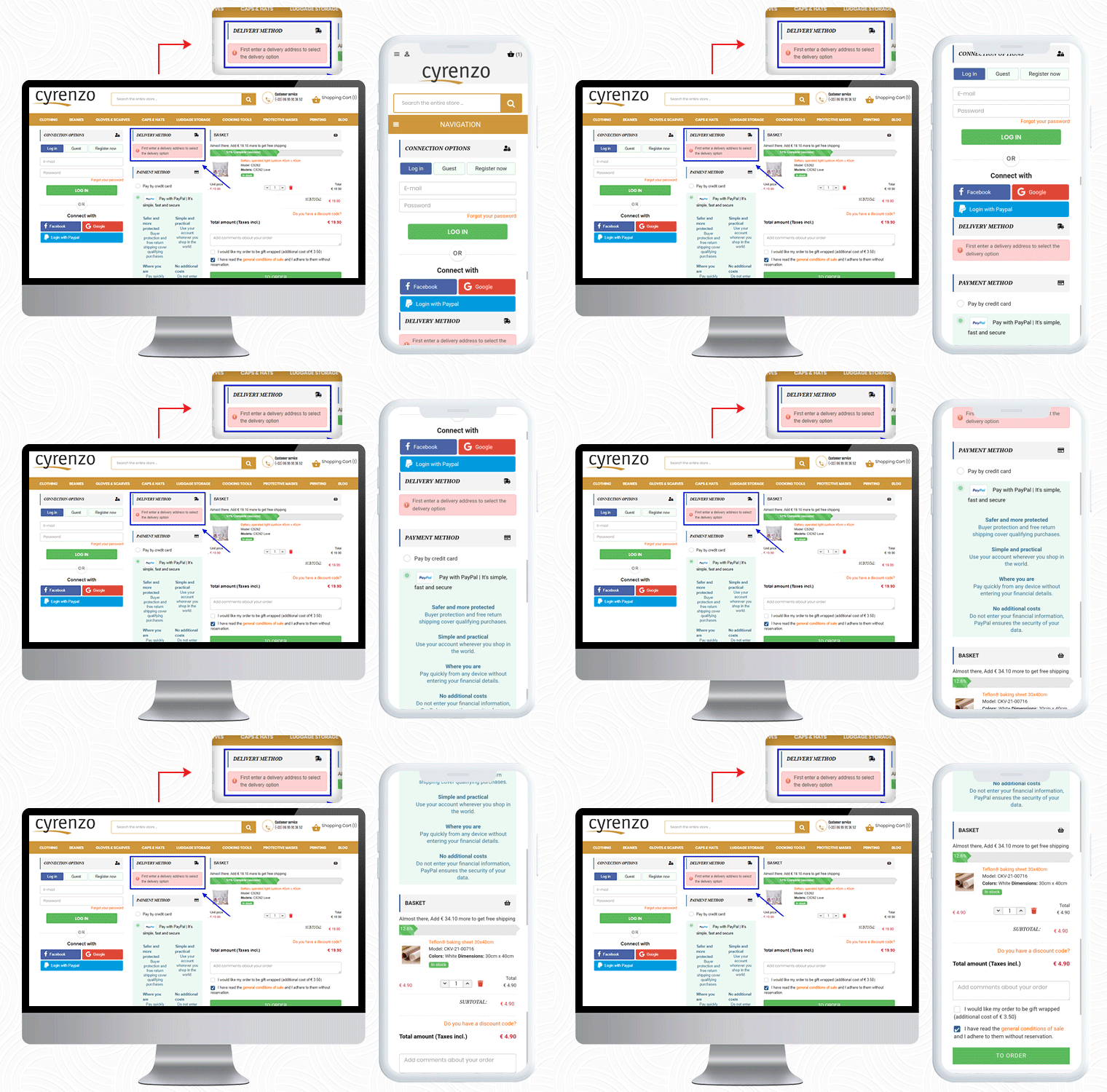
Cyrenzo is France based online store of clothing, accessories, and home products from major brands. They deliver quality products with customized options in France. Cyrenzo has updated its new website to meet current expectations so that users can use it more easily.
They have been using the One Page checkout solution for the final checkout process on their PrestaShop store.
As mentioned, the module is feature-rich and a best seller!
It allows sellers to display the delivery mode only after they enter the delivery address if enabled from the admin panel.
Cyrenzo is also using the PayPal login option along with Facebook and Google on their PrestaShop One Page Checkout. On a single page in a 3-column customizable layout, it displays the progress bar, cart details, payment methods, etc.
Also, to collect any additional information from the customer about the order, the seller can add an additional field before the final order placement.
Visit KnowBand store for Product Demo:
5. Kongic
So far we have shown you four examples of One Page checkout module. Now, I would like to draw your attention to its layout customization feature.
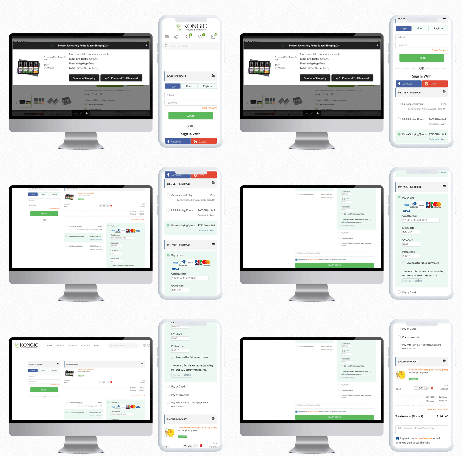
Kongic is an eCommerce company dealing in skincare and body care products. For the checkout page, PrestaShop One Page Checkout is the best fit for their brand.
The checkout page of the Kongic is clean and they have kept enough white space that it giving it a more pristine look.
It is on the seller how and where they want to keep the sections. The module has a drag-n-drop functionality and they can adjust the fields as they want.
It gives you options like 1-column layout, 2-column layout, and 3-column layout. Customize the checkout page as you want to.
6. Tiendatinta
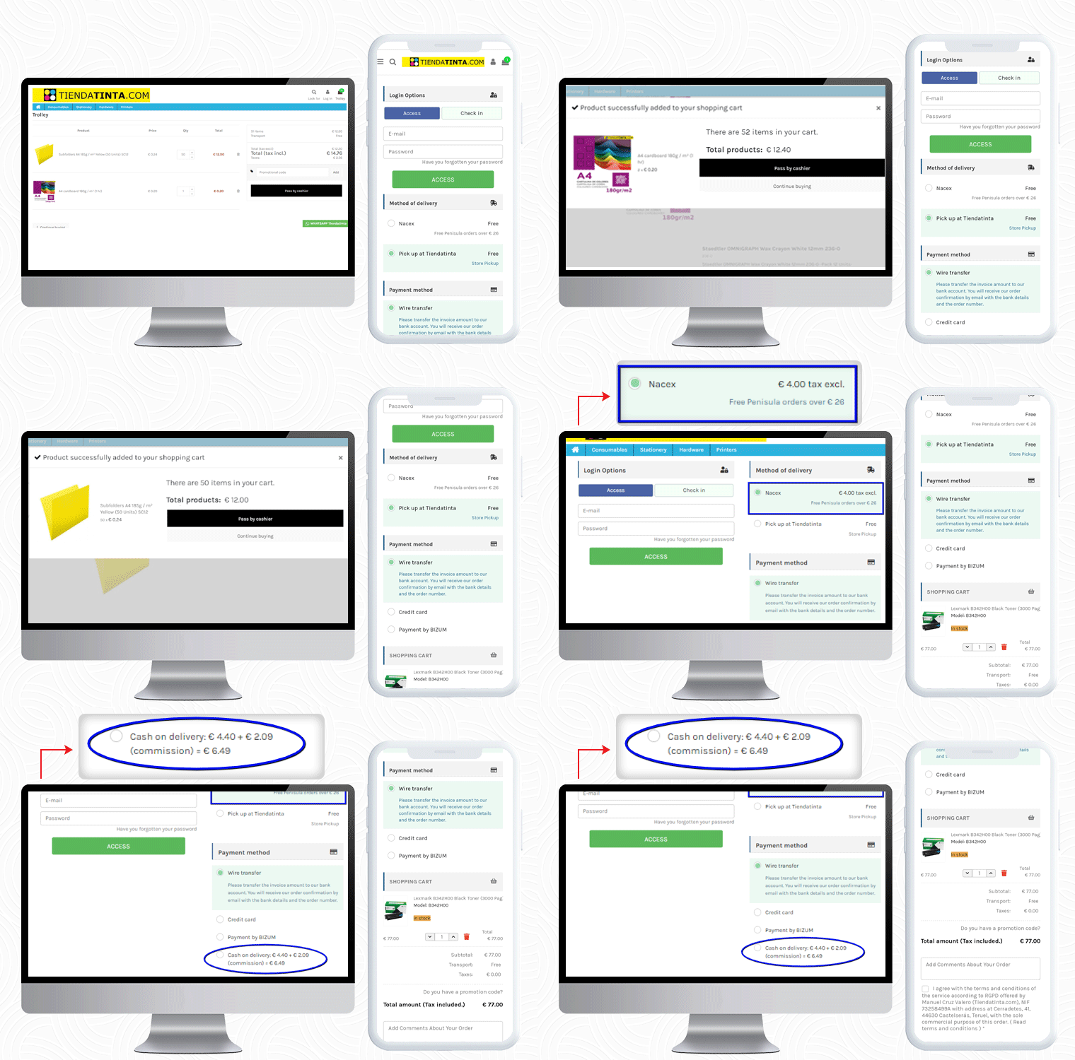
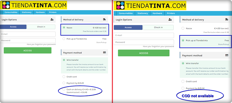
Tiendatinta is a PrestaShop store that sells Stationery products, hardware, and different types of printers.
They have been using the PrestaShop One Page Checkout solution for checkout that gives a satisfactory experience to their customers.
In this PrestaShop One Page Checkout module example, the Cash On Delivery (COD) is only available for the customers who opt for the Nacex method of delivery.
This feature is quite helpful when you have to offer a particular mode of payment gateway for and specific delivery method.
7. JustKBC
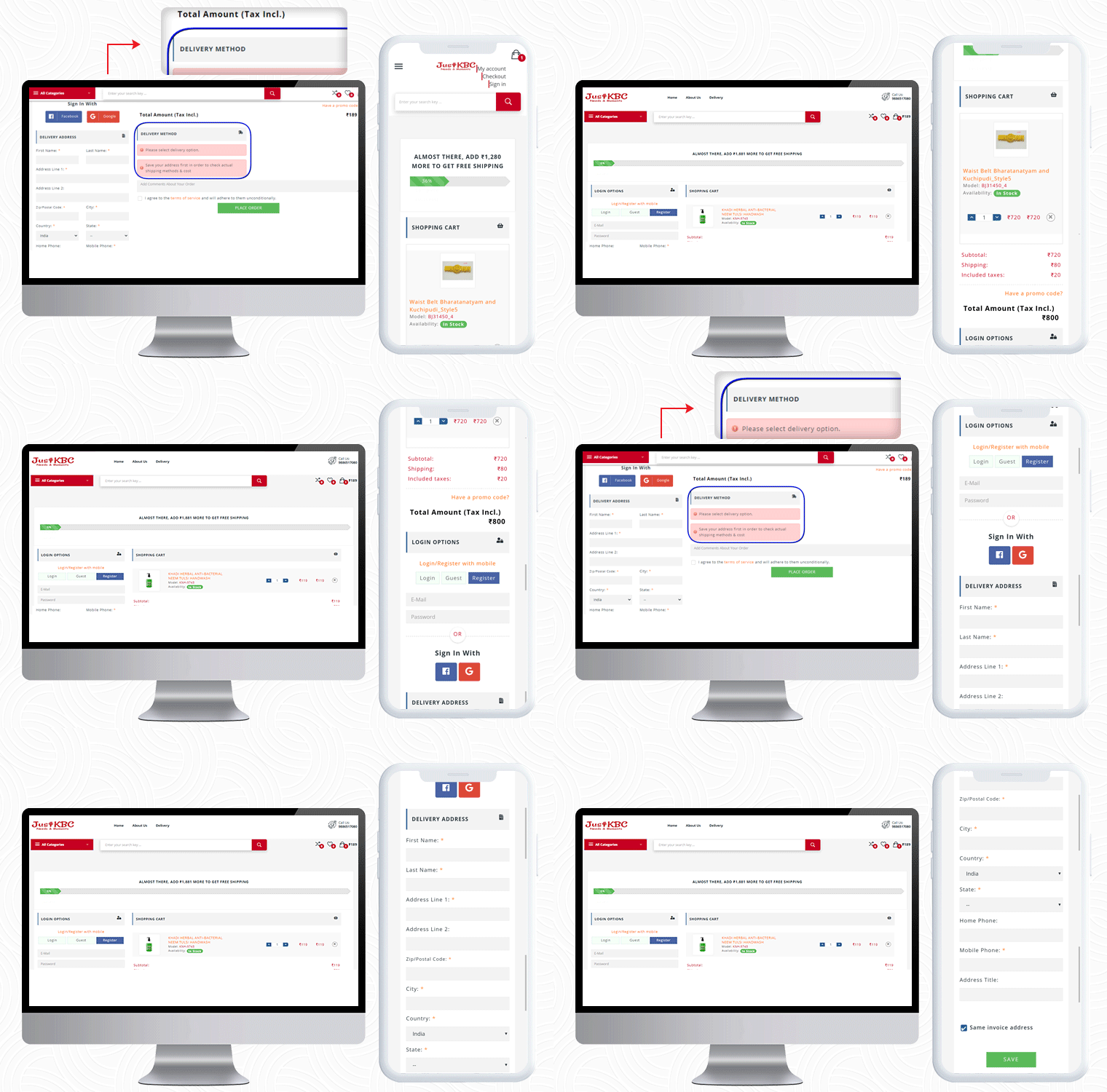
For PrestaShop One Page Checkout real-life example, the JustKBC website is next in the row. They are using a 2-column layout, which is giving the checkout page a clean look.
A free shipping bar at the top of the checkout page encourages customers to shop more and increases average cart value.
On this particular checkout page, if a customer wants to see the delivery options then he has to enter the delivery address first.
If a customer enters false details of ZipCode or forgets and mandatory field, they will see an inline error message. If The customer can allow auto address fill from Google as well.
You can check out some more websites that are using PrestaShop One Page checkout:
10 Best Checkout Page Examples and Practices for Italian PrestaShop store
Ten on fleek Checkout Page Examples of Poland PrestaShop eCommerce stores
10 Elite Examples of Checkout for Spain PrestaShop stores
To Wrap-up:
The preceding examples demonstrate why PrestaShop One Page Checkout by KnowBand is the best seller Module on Addon Store! Its features and functionalities make it unique and give an exemplary user experience. If you have an eCommerce store on the PrestaShop platform and are searching for a single-page checkout solution, your quest is over. You can go to the KnowBand store and look at the admin panel and front-end module demos.
On our store, you’ll find solutions for all other eCommerce services. All the modules are well-designed from both the seller’s and the customer’s perspectives.
Read More about PrestaShop One Page Checkout:

