It’s been more than one and half year since the PrestaShop came up with PrestaShop version 1.6.1.0, the last major update. The stable version of PrestaShop is finally out for all. Before that, PrestaShop has been testing the Beta versions for a long time. The development versions were already available on the official site for testing. The new version excited me too, so I did some testing. Surprisingly, I was struggling to even install it on my local host.
After going through the release notes, I discovered that PrestaShop has been through a complete makeover. On your local host you need to do some additional setups to make it compatible with the new frameworks and structures. This time, I read the release notes and instructions very carefully as I did not wanted to repeat my mistakes again and taunt the PrestaShop developers. While going through the documentations I picked up some interesting points (that I tested on my localhost too before writing) .
Major highlights of the new PrestaShop 1.7 update include:
1. Introduction of Symfony2 framework-
Based on Symphony framework, PrestaShop 1.7 is a completely new architecture. However, it’s confirmed that as of now, only Back-Office will have the new architecture. The two pages on back-office will be in radar of the new the architecture- the product page and the Module page. With the introduction of Symfony2 in the these two pages, PrestaShop 1.7 has received a complete makeover that I will be discussing in the later part. For now, until a complete transition happens, the two architectures- Symfony and twig templating engine will coexist.
With the new framework in these two pages, it is also clear that the custom modules which target the pages other then these two pages (the product page and the Module page) will not need adaptation. They will work as fine as they were working on the previous version, but the PrestaShop also recommends the developers to adapt their modules ASAP. Soon enough the new architecture would expand to the whole system.
2. A Brand new default theme along with a starter theme-
When you install any PrestaShop on your system, it welcomes you with a pre-configured theme and a set of products- The Default Theme. In PrestaShop 1.7, the new theme has a different name – “Classic”. The new Classic theme is competent to meet all the basic Web and eCommerce requirements, and off-course it is fully responsive.
Along with the “Classic” a new interesting feature called as “Starter Theme” will also be there. Basically, with Starter Theme anybody with a skill set for HTML and CSS can design a completely new PrestaShop theme from the scratch. Earlier, designing a new PrestaShop theme from the scratch was a very tricky task; it was required to have skill set for HTML and CSS, and addition, it was also required to have a comprehensive knowledge of inner PrestaShop structures. With the new Starter Theme, one can design the new PrestaShop themes in no time, and can easily replace the old default-bootstrap theme. The Starter Theme will not consist any bootstrap. It is expected that only a knowledge of CSS and markup is enough to generate the implementation.
3. The reworked Product creation page-
PrestaShop has always been popular for providing easiest user interface to the non coders. It is a non-coder who mostly do the uploading and managing of a product. The Product upload and management interface in PrestaShop 1.7 claims to provide the non-coders a hassle free interface for uploading and managing the products. The newly added Symfony framework ensures the best UX for the PrestaShop website owners until now. Not only the product upload, but the creation of product combinations have become somewhat more simpler. You have to just enter the attributes and their values, PrestaShop will generate the combinations automatically. Say, you want to create a combination for all the available colors and sizes. Just input the color:all, size:all, and its done.
New shortcuts:
Duplicate (CTRL + D): Used to save the current product and duplicate it.
Go to catalog (CTRL + Q): Used to save the current product and lead to the catalogue page.
Add new product (CTRL + P): Used to save the current product and creates a new, empty product page.
Save (CTRL + S): It will save the product and stay on the current product.
4. A new module listing – or a new App Store?-
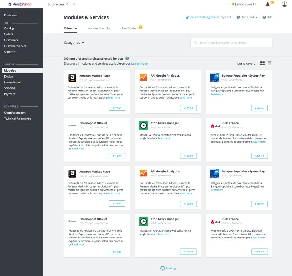
You can see a major change in the Module page. With the inclusion of Symfony2 Framework, the new module page has changed a lot. A lot means, a lot like the new interface is now more like an App store. The new modules display is a card design view. The categories of the module have a perfect sync with the categories of the modules on the official PrestaShop store. They have also changed the filter for Installed and recommended modules. There are now two new tabs – “Selection” and “Installed modules”.
The selection tab consist of the recommended modules from the official module store. The installed module tab is used to displayed all the modules that are currently installed on the site. It is expected that with the new look of the module listing, the Module page will soon transform itself into a App Store. However, It has already been transformed up to a major extent. The new features added to the module page are:
Configuration key to check the configuration of the module.
Change log to see the new features or update whenever a new update is released by the developer of a module.
Segregation of Installed, to be installed, and needs update module in separate sub-tabs

Conclusion
The new PrestaShop 1.7 update seems to be a promising one. Lets see, how far we can go with the Symfony2 and it’s architecture. As of now, we can PrestaShop 1.7 have focused largely on improving the UX for both the admin and customer point of view. The new structure claims to impact the SEO of the site in a more positive way. However, it would be interesting to see if it can compel the already established businesses to upgrade their PrestaShop store to a completely changed interface.
This Would Also Interest You


